Home › Forums › Photography Q&A › How to get words to shine through better
- This topic has 9 replies, 7 voices, and was last updated 7 years, 6 months ago by
 Benjamin Holmes.
-
AuthorPosts
-
January 2, 2019 at 6:19 pm #35966
 Ben GlickParticipant
Hey I have a really bad problem that has started coming up, could use some help, so in the photo’s I take that contain bible verses I usually always strive to make them professional, nice font, white letters, (keep it clean.).
I will use this photo as an example, there are certain photo’s I take that are like so densely colored that even the white letters don’t show through. (I don’t use black letters because they disappear almost immediately, they are even worse than white letters).
So I retreated to using a like aurora around the letters to make them show through, this was a horrible idea, it look like a nine year old did it, (I used purple to help the Aurora stick out and show more.)
Does anyone have any ideas on how to fix this? I know there are somethings that we are just stuck with as there are no loopholes, however I thought I would ask. (real quick, if anyone asks, the opacity is all the way up, it still doesn’t work…)
Attachments:
January 2, 2019 at 6:54 pm #35972 Lyd-BParticipant
What program are you working with, Ben?
Also, in the example you gave here, if you just move the words to the bottom left side of the photo, there’s less going on in the background so that would be easier to work with in the first place.
January 2, 2019 at 7:26 pm #35976Ben GlickParticipantHey! Awesome stuff! I use a Mac Program called PhotoScape X I did go and buy the full version.
I tried what you advised before, the result is the background is still too strong, with no aurora the words almost literally disappear.
In the picture below I have attached writing in all four corners at full visibility. While they do shine through, they just seem really hard to make out to me. Maybe I’m wrong, your input on it would still be nice though.
Attachments:
January 3, 2019 at 11:08 am #35986 Silas WoodwardParticipant
try making the letters thicker maybe then they wont blend in as much?
January 4, 2019 at 11:46 am #35995Lyd-BParticipantI’d just suggest that you experiment with different fonts (perhaps try a more simple font), different thicknesses, or maybe try to have a block behind the words, etc.
January 5, 2019 at 4:59 pm #36020 Clara JohnsonParticipant
Hi Ben, I definitely feel your frustration here. Sometimes the more I work at something, the worse it seems to get, until I walk away from it and come back with a fresh perspective. Even then, sometimes I just need to start over from scratch, even though that can be a bummer.
Here are my thoughts. I’m not sure your reasons for using this particular picture, but it doesn’t seem to me to be the best picture to put words on top of. I usually use pictures that have a large “blank” area, such as sky, foliage, mountains, grass, etc. Make sure that the picture is high quality and that the blank part is not boring, it’s just not the subject of the picture. For example, check out the picture James used as a header for Lenspiration – the girl with the camera is the focus, but there are mountains and sky in which you could place text. I also like to look through calendars and see how they put text/Scripture/quotes onto pictures. Having a workable photo to put text on is definitely the first step to success. Then, think about font, sizing, color, and arrangement of the words.
Good job for always striving for a clean and professional look! That is not always easy, but don’t give up!
January 5, 2019 at 8:46 pm #36029Ben GlickParticipantHey thanks to everyone for all the advice! You guys are awesome!
One thing Clara, first, thanks so much for taking time to look at stuff, your opinion is not only helpful but valued.
1. This photo was chosen to be difficult, it was to get people to really think about wording and thinking past like a “blank” spot in the photo. I understand there are some tips and tricks to make the words shine better through. I was just asking to really see if someone here had advice that I had never heard of before.
Thanks for all the work and time thinking into this photo!
(needless to say I have found what I was searching for!)
January 8, 2019 at 11:30 am #36070 James StaddonKeymaster
Hey @ryanben2, the principles in this video would apply to your situation, especially in choosing fonts for your text: https://www.lenspiration.com/video/creating-watermark/
Also, just so you know, the purple “aurora” you got going there is technically called a text “glow”. It would be called a text “shadow” if it was off to one side of the letters instead of completely surrounding them.
- This reply was modified 56 years, 7 months ago by .
January 9, 2019 at 10:35 pm #36174Ezra Morley
ModeratorSome excellent advice here already! I’ll just add my 2 cents… 🙂
When a shadow or a “glow” doesn’t make the text stand out enough, you need to get a little more drastic. Think about it; what you’re really looking for is contrast. If you can’t read the text, it’s simply because your eyes are having a hard time picking it out from its surroundings. As others have already mentioned, your font choice will make a HUGE difference here.
So the question becomes, “How can I increase the contrast between the letters and the background, besides using a big bold font?” We have basically 2 options: make the font darker/lighter OR make the background darker/lighter. If we’ve made the font as bright or as dark as we can and still can’t see it well enough, then that means we have to work on the background.
Check out these examples.

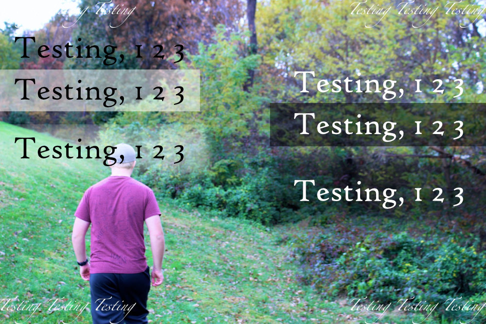
As you can see, the 2nd thicker/bolder font does a MUCH better job at standing out. But the main difference is the change in the background which makes the text stand out more.
For some good examples of this technique, check out some of @bensharpeningcharacter’s work here:
(Click to open larger in a new tab)


- This reply was modified 56 years, 7 months ago by .
Attachments:
January 15, 2019 at 11:58 pm #36327 Benjamin HolmesModerator
Thanks for thinking of us @buddingphotographer!
The struggle is real. I’ve had a little experience with trying to get type to stand out against difficult backgrounds, so here are a few tips:
Do not use a script typeface if you are struggling to make text stand out. Its delicate curves and forms are difficult to make out on a clean photo and have a limited use case. Try using a sans serif or serif typeface instead.
Bold your text. As Ezra pointed out, the goal here is contrast. You need to make the eye be able to make out the letterforms, and bold text makes those letterforms bigger!
Make your text larger. This is a luxury I can’t use often for the VersePics because of the format requirements, but it’s a good design principle to use!
Use a subtle shadow and ONLY a subtle shadow! Here’s a good rule of thumb: if you can see the shadow, it’s too much. There certainly are exceptions but for placing text on photos, not many. Visible shadows distract and take away from the photo and text. It helps your text stand out, but not in a good way. Keep the opacity of shadows low and try to match a dark shade in the photo to make the shadow look more natural. Try using the Multiply blend mode for an interesting, and useful, effect.
Use a transparent background. This is my absolutely last resort but I turn to it for a reason. It dramatically increases the contrast between the text and the background and, while very obvious, doesn’t look bad and can even elevate your design. Try using multiple shapes, opacities, and blend modes till you get the effect that you want.
Either use perfectly white text or a dark shade from the background. If you have to use a darker color for your text, try to find a dark shade from your photo or darken a shade from your photo. Do not use perfectly black text. Using a shade from the photo makes the text appear more natural.
Intentionally underexpose your photo or use a dark overlay. This is quickly becoming one of my favorite techniques because it is an elegant solution to a hard problem. The darker background helps the text stay legible while also making the text the center of attention. This definitely won’t work for every photo, though, so keep that in mind.
In all of these suggestions, there is one constant guiding rule I follow. Keep it subtle. While it can be hard to see how that applies to a transparent background, only go as far as you need to make the text legible, then stop. Over the top effects only serve to make designs seem amateurish while stripped back but effective designs will be seen as more professional. Knowing what works and what to turn to will come with time and experimentation, but make sure everything you do contributes to the design rather than takes away from it.
Hopefully, some of that helps!
-
AuthorPosts


You must be logged in to reply to this topic.