Home › Forums › Shoot to Serve Assignments › Proverbs 3:5-6 VP Challenge (ends February 14)
- This topic has 47 replies, 8 voices, and was last updated 5 years, 1 month ago by
 Blessings Captured.
-
AuthorPosts
-
February 12, 2019 at 10:38 pm #37116
 Caitlin ComptonParticipant
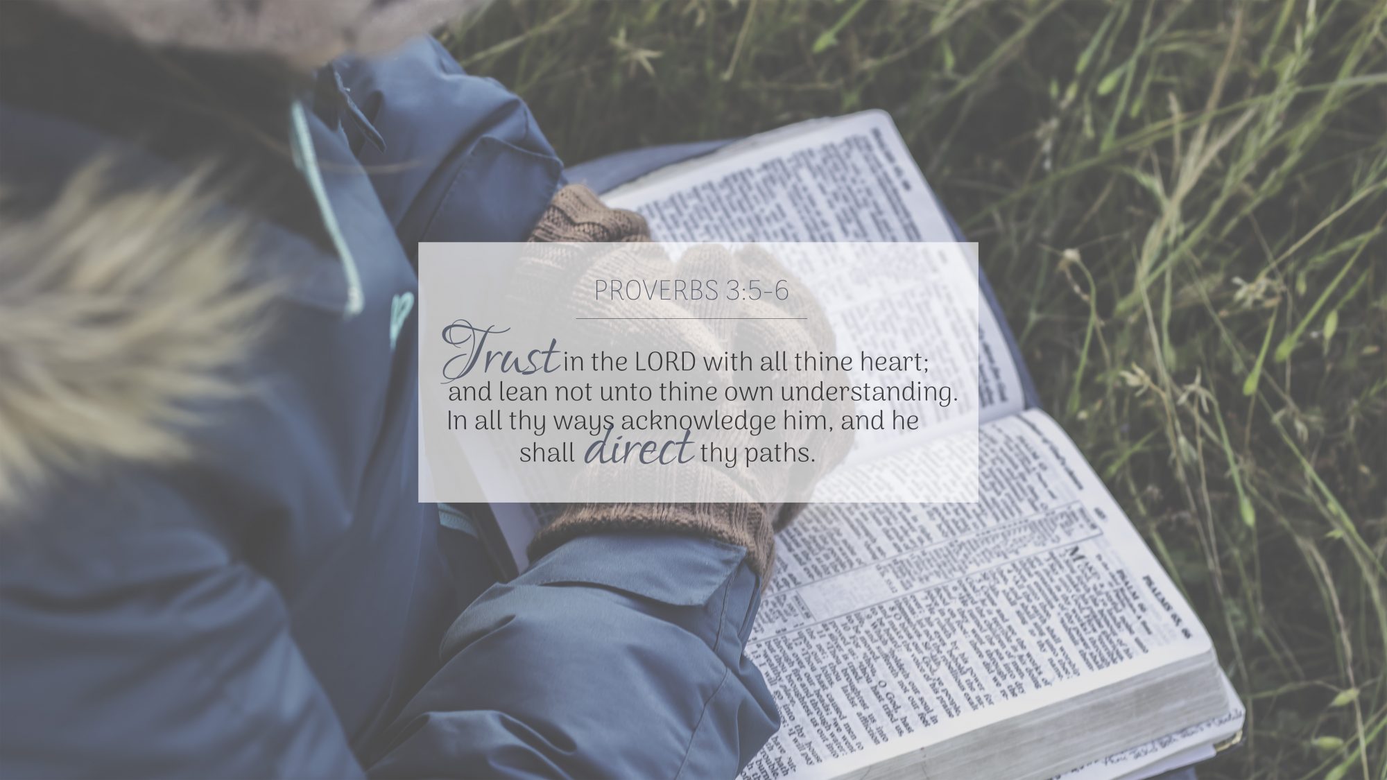
Oops! Realised that I didn’t have a very even amount of space between the reference and the top of the box and the bottom line of the verse to the bottom of the box. SO, here’s the updated, updated version! 🙂
Attachments:
February 12, 2019 at 11:44 pm #37118Morgan GiesbrechtParticipantThank you for the feedback, Ben!
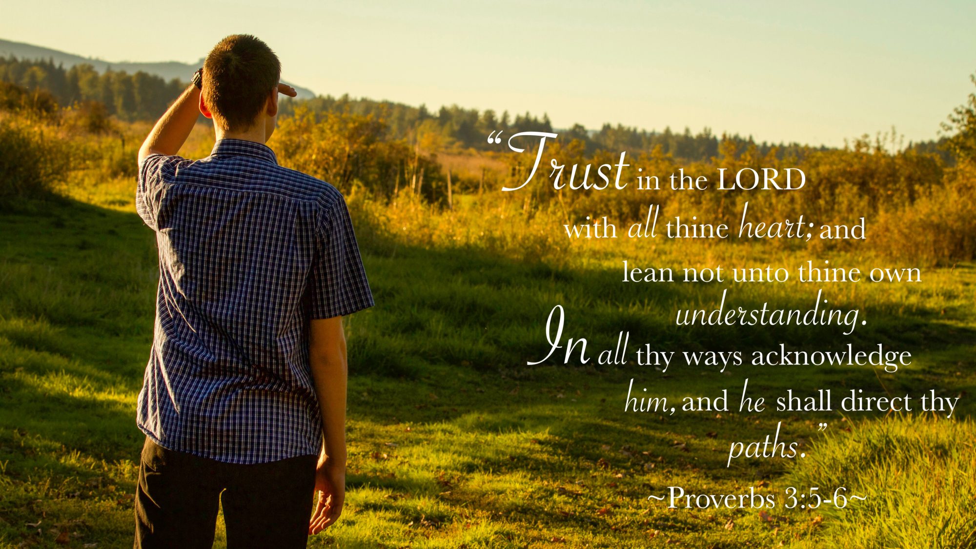
Being new to wallpaper design myself, your comments have given me a lot to think about and apply (as best I can). Since I took this photo last fall, I can’t remeber why I didn’t utilize f/11-22 when I was taking the picture. It may have been that it was too cold and I was in a hurry or I may just have not noticed the aperture right away; either way, it’s something I’ll remeber to watch for in the future.
After processing your critique, I gave this image another try and this is was I came up with. 🙂
Attachments:
February 21, 2019 at 8:08 pm #37239Eliana FranzenburgParticipant@bensharpeningcharacter Thank you for your advice! I will definitely keep all that you said in mind!
February 25, 2019 at 5:26 pm #37303Benjamin HolmesModeratorHey everyone!
Sorry I’m so late to get back to this. I got swept into a CRAZY week of school and had to drop everything just to keep up with the assignments.
I’ll be working to comment and get back on track throughout the day.
February 25, 2019 at 5:26 pm #37304Benjamin HolmesModeratorI definitely like the grey text better than the yellow. Great choice! It’s bright enough to stand out, but doesn’t blind you when you have a bright screen! 😉 (I’ve had some interesting experiences with this.)
I think I like the simple text breakup version you made (#1) better than the more complicated one that followed the path (#2).
#1 You placed the centered text box just a little off center to the right, and since the photo’s subject is also to the right, it makes the design feel a little unbalanced. Horizontally centered text might work a little better there.
#2 Just a quick warning. If you are going to break text up like that, be very careful to think about how the sentence flows. The best way I can explain this is to think of poetry. If you have a return or line-break that sounds jarring when you read the text aloud, then you probably want to rework the line-breaks. Group connected words and try to make sure each line makes sense. For example:
“In all thy ways
acknowledge him,
and he shall
direct thy paths.”flows a little better than
“In all thy
ways acknowledge
him, and he
shall direct
your paths.”Hopefully that makes sense!
Overall, though, much better! 🙂
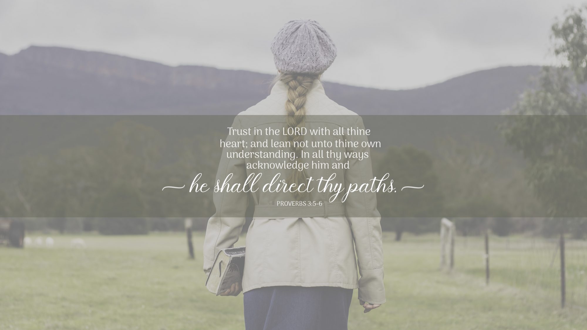
February 25, 2019 at 6:48 pm #37308Blessings CapturedParticipantThat does make sense about breaking up text. Thanks! I’ll keep it in mind.
But what is horizontally centered text?- This reply was modified 54 years, 4 months ago by .
February 25, 2019 at 7:51 pm #37310Benjamin HolmesModeratorBy far I prefer the cropped design. Nice job! It feels much more balanced than the other designs, but still feels a little unbalanced because the tunnel curves away in a certain direction. Perhaps if you right aligned all the text so it matches the exit of the tunnel and moved it over slightly to the left the design would appear more balanced.
As for the other revised design with the bridge photo, I like it better than your original, but I don’t know that I would use the color brown for the overlay there. There is a lot of that color in the photo with the stones in the bridge, and it isn’t a color that draws my attention. Perhaps if you tried a nice green? Good call on the overlay, though!
I would highly encourage you not to stick with one layout for the text across your multiple designs. Experiment. Try some new things. The layout you created will work well in some situations, but not in others. Now that you know that design works, paste the verse in with no formatting and start again. See what happens! Some of my favorite designs came out of taking some time to experiment and see what was possible. 🙂
I find it a little odd that “Trust” and “paths” have a drop-shadow but the rest of the verse does not… Try to keep things consistent across your design. If part of it has a drop-shadow, but it isn’t there to show it as being closer to the viewer than the rest of the text, either remove it or use it so the design is consistent.
You’re definitely improving! Keep up the good work.
February 25, 2019 at 8:08 pm #37311Benjamin HolmesModeratorYour updated, updated version looks a lot better, and the padding around the verse looks MUCH better! 🙂
I’m not totally sold on the display (fancy) typeface for that photo. It feels a little too bold compared to the other typeface for my tastes right now, but that could be a personal preference. Perhaps if you made the display portions of the design smaller it would help?
I don’t think putting the reference in the body typeface, all-caps, and in a lighter weight was the right call for this particular design. It adds a complication to the design that I think is unnecessary… Perhaps you could try using the display typeface there in a slightly smaller size or just make the reference the normal weight of the body typeface and reduce its size
Your second design looks much better as well! The more opaque overlay definitely helped with legibility.
It feels much more polished. Keep up the good work!
February 25, 2019 at 8:28 pm #37314Benjamin HolmesModeratorI would definitely echo what I told @blessingscaptured about breaking up text here. You’ve got two words on their own lines, which isn’t ideal. Be careful about how you break up your text.
Your design should always have at least one axis. Think of this axis as an invisible line running through your design that things are placed up against in your design. This invisible line helps guide the viewers eye to the next line of text because they know subconsciously know where to look. Because your text isn’t on an axis here, it is harder to read than it needs to be. Unless the goal of a design is something abstract, the viewer should be able to read the text in your design very easily. Your first design was a little easier to read because it had a vertical axis generated by the centered text. Perhaps the design would read a little better if you left-aligned the verse to create a strong vertical axis.
Again, be careful about how much you choose to emphasize. Right now, you are in some way emphasizing 11 out of 29 words in your design. That’s up from the 8 you emphasized in your previous design and too many for the text to be easily discernible. Because the verse is so inconsistent in style, I have a hard time reading it quickly and telling you which words you were trying to emphasize. Think very carefully about what exact words you want people to come away with and emphasize those. You don’t need the first and last words to be emphasized just because they are first and last, and you don’t need to emphasize every keyword in the verse.
Keep working at it, Morgan! These things will come naturally with practice. 🙂
February 25, 2019 at 8:40 pm #37315Benjamin HolmesModeratorHey guys!
I’ll continue to reply and critique VPs if you’d like to keep revising your submissions, but as it is past the deadline, I’m going to go ahead and wrap this up!
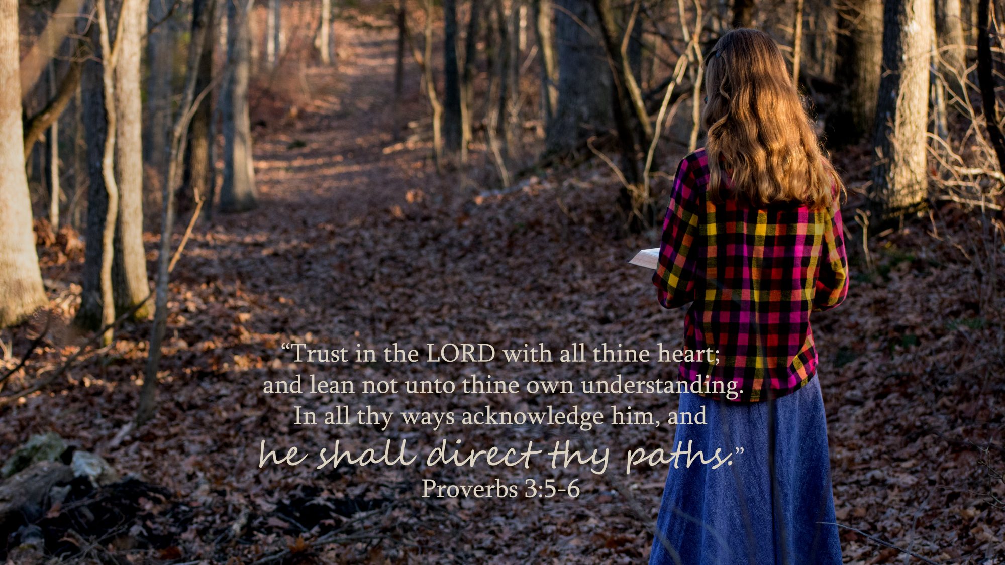
My favorite design submitted so far was one designed by Caitlin Compton.
%22%20transform%3D%22translate(4%204)%20scale(7.8125)%22%20fill-opacity%3D%22.5%22%3E%3Cellipse%20fill%3D%22%23dfdfdf%22%20rx%3D%221%22%20ry%3D%221%22%20transform%3D%22matrix(-.81826%2019.85364%20-115.43335%20-4.75754%20109.8%203.6)%22%2F%3E%3Cellipse%20fill%3D%22%23666%22%20cx%3D%22236%22%20cy%3D%2271%22%20rx%3D%2271%22%20ry%3D%2229%22%2F%3E%3Cellipse%20fill%3D%22%23666%22%20cx%3D%2228%22%20cy%3D%2267%22%20rx%3D%2260%22%20ry%3D%2227%22%2F%3E%3Cellipse%20fill%3D%22%23a3a3a3%22%20rx%3D%221%22%20ry%3D%221%22%20transform%3D%22rotate(6.6%20-215.2%20462.3)%20scale(101.79555%2013.39767)%22%2F%3E%3C%2Fg%3E%3C%2Fsvg%3E)
I like this because of its simplicity.
The strong vertical axis created by the centered subject and text helps keep my attention and helps me to realize where to look next. The centered layout emphasizes the symmetrical aspects of the photograph, and while I will admit freely the photo isn’t perfectly symmetrical, I do like that the subject of the photograph and of the entire design is very clear.
The text is formatted very nicely and I can immediately understand what Caitlin thought was important about this verse–if we acknowledge the Lord in every area of our lives, He will direct our paths as we rely on Him for guidance!
To Caitlin, congratulations, and to all of you who submitted, thank you! You guys did a great job revising your designs and growing from the critique. Don’t stop practicing! You guys are improving steadily.
Benjamin Holmes
VersePic Director and Co-Host of the Sharpening Character PodcastFebruary 27, 2019 at 9:39 pm #37385Lydia-BParticipantThanks again for the critique, @bensharpeningcharacter! It’s been very insightful.
February 28, 2019 at 1:08 am #37386Caitlin ComptonParticipantThank you for all the time you put into this challenge, @bensharpeningcharacter! It’s exciting that you chose mine as winner! 🙂
Everyone else did such a wonderful job! It was fun to see everyone’s designs get better as they got critique and fun to see the different designs everyone came up with using the same verse! I’m looking forward to the next challenge.
In regards to the latest critque you gave my verse pic – I see what you mean with the front being bold, I’m not overly crazy about this design now, but here it is with your suggestions! 🙂
Attachments:
February 28, 2019 at 7:11 pm #37421Benjamin HolmesModerator@blessingscaptured
When something is vertically centered, there is an equal amount of space on the top as on the bottom. When something is horizontally centered, there is an equal amount of space to either side. For that photo, I thought horizontally centering (NOT vertically centering, or I would have just said centered) the text would help with the composition.
@creative-click-photography
It certainly feels more balanced now, but at a cost. You’ve definitely lost a lot of the contrast between the emphasized words and the rest of the verse. You may want to keep playing with that. Inline text is always difficult to work with!
I would definitely play around with the spacing between the reference, line, and verse. The proportions are a bit off–some places need a little more room to breathe while others have too much space.March 5, 2019 at 5:21 pm #37558Blessings CapturedParticipantThank you @bensharpeningcharacter. I understand now!
How does this look?Attachments:
March 7, 2019 at 5:56 pm #37603Benjamin HolmesModerator@blessingscaptured
Better. Definitely better, though I think if you moved it up slightly, the design would look a little more balanced. -
AuthorPosts

You must be logged in to reply to this topic.