Home › Forums › Photo Critique › Personal Quiet Time
- This topic has 7 replies, 5 voices, and was last updated 1 year, 8 months ago by
 Lydia Bennett.
-
AuthorPosts
-
August 4, 2022 at 6:21 pm #71690
 Laura LaneParticipant
Hello,
I’m Laura’s sister, Jemima (12 yr)
I didn’t really want to put these photos in to be judged, but I would like critique.
Also does any one have a suggestion of what signature looks best?
Thank you,
JemimaAttachments:
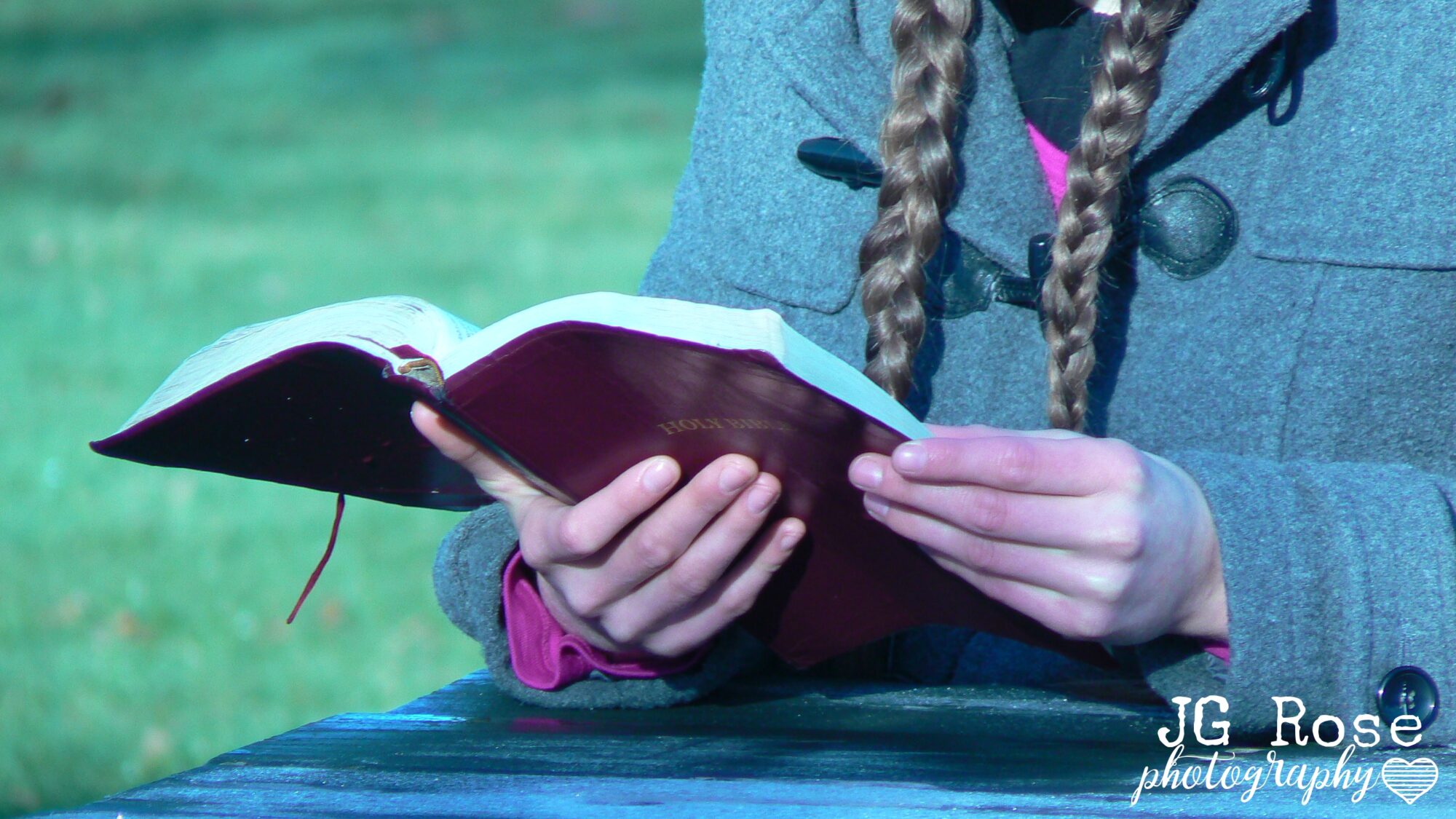
August 4, 2022 at 9:42 pm #71693William FrazerParticipantHi Jemima,
You’ve got two good compositions there, especially the second. The second feels a lot more personal than the first (though both are well done); I can see the person, rather than just their hands. I can feel that they are sitting, perhaps meditatively quiet, reading.
Also, your focus in both shots is tack-sharp, with a gorgeous background blur.A comment would be that your white balance (the balance between yellow-blue and pink-green) is shifted a lot towards the blue, and a tad towards the green. That tends to make a picture look “cold” and a bit unwelcoming. This is an adjustment you’ll have to do on the computer in post-processing. Just as an example, I’ve attached a “warmed-up” version of your picture.
-
This reply was modified 1 year, 8 months ago by William Frazer.
Attachments:
August 6, 2022 at 12:07 am #71728Laura LaneParticipantThank you,
Is there any way you can change that on the camera so that you don’t have to edit every picture?
This morning I came across a filter (If that’s what you call it) on the camera that went between blue and red would that be good enough?
I don’t know how to get to that now though😊August 6, 2022 at 8:35 am #71736Blessings CapturedParticipantYes, you can change the color in camera! And it’s best to do it that way if you’re shotting jepg. Changing the white balance (coloring) after the fact will make your picture more grainy.
You should find the white balance in your shooting menu. It’ll be labeled with wb or a little picture of a sun, cloud, lightbulb etc. You set that to whatever lighting conditions you’re shooting in. For example if you’re in full sun, set it to the sun.
Keep learning!
-HannahHere’s a Lenspiration lesson about white balance.
https://www.lenspiration.com/lesson/understanding-white-balance/
August 6, 2022 at 10:59 am #71739James StaddonKeymasterI like the first signature with the flower petal!
August 8, 2022 at 9:55 am #71747Lydia BennettKeymasterSame here!
August 8, 2022 at 4:35 pm #71748Laura LaneParticipantThank you Hannah, that’s good to know, and thank you for the link😊
And about the signature, I like the flower too😄.Just so you know I don’t send messages at 12:07am (it’s daytime here in New Zealand)
JemimaAugust 12, 2022 at 10:45 am #71785Lydia BennettKeymasterHaha that’s great 😄
-
AuthorPosts


You must be logged in to reply to this topic.