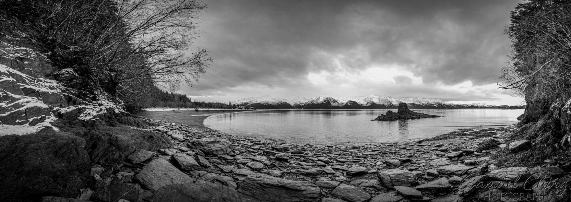
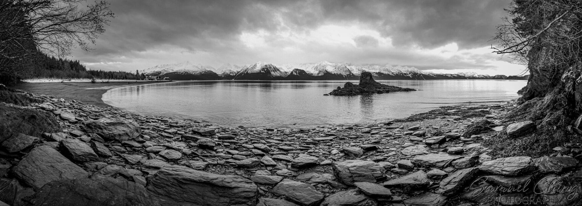
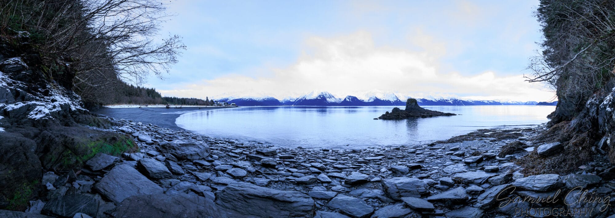
Turning a photo monochrome is a unique and interesting idea – it just changes what you can use the photograph for. From my amateur perspective, I think you’ve nailed it. I’d hang that on my wall any day.
As for the crop, personally I like Color-Resurrection-Bay-Panorama-1.jpg best (though I’d like it even better if it were monochrome like the others.)
BW-Resurrection-Bay-Panorama-2.jpg has very little foreground content on the left, whereas
BW-Resurrection-Bay-Panorama-1.jpg has too much weight on the left, and distracts the eye.
Both feel unbalanced. The crop on the colour version (IMHO) has nailed the balance between framing and foreground-middleground-background ratio.
Great job.
 .
.