
Home › Forums › Photo Critique › Family photo
- This topic has 5 replies, 4 voices, and was last updated 7 years, 1 month ago by
Dan Cope.

-
AuthorPosts
-
September 9, 2019 at 1:13 pm #43938
 Kina LambParticipant
I recently did an extended family photoshoot! (For a client, not my family. ☺️) This is one of the pictures. I like it, but I don’t think it really ‘pops’. I think it’s mostly because of the colors, but does anyone else have any ideas why? Do you think if could be fixed with editing?
Also, if this was a picture of YOU, do you think you would be happy with it? Would you put it on the wall? Why or why not?This picture sort of puzzles me. 😂
Thanks! 😁😁
-Kina
Attachments:
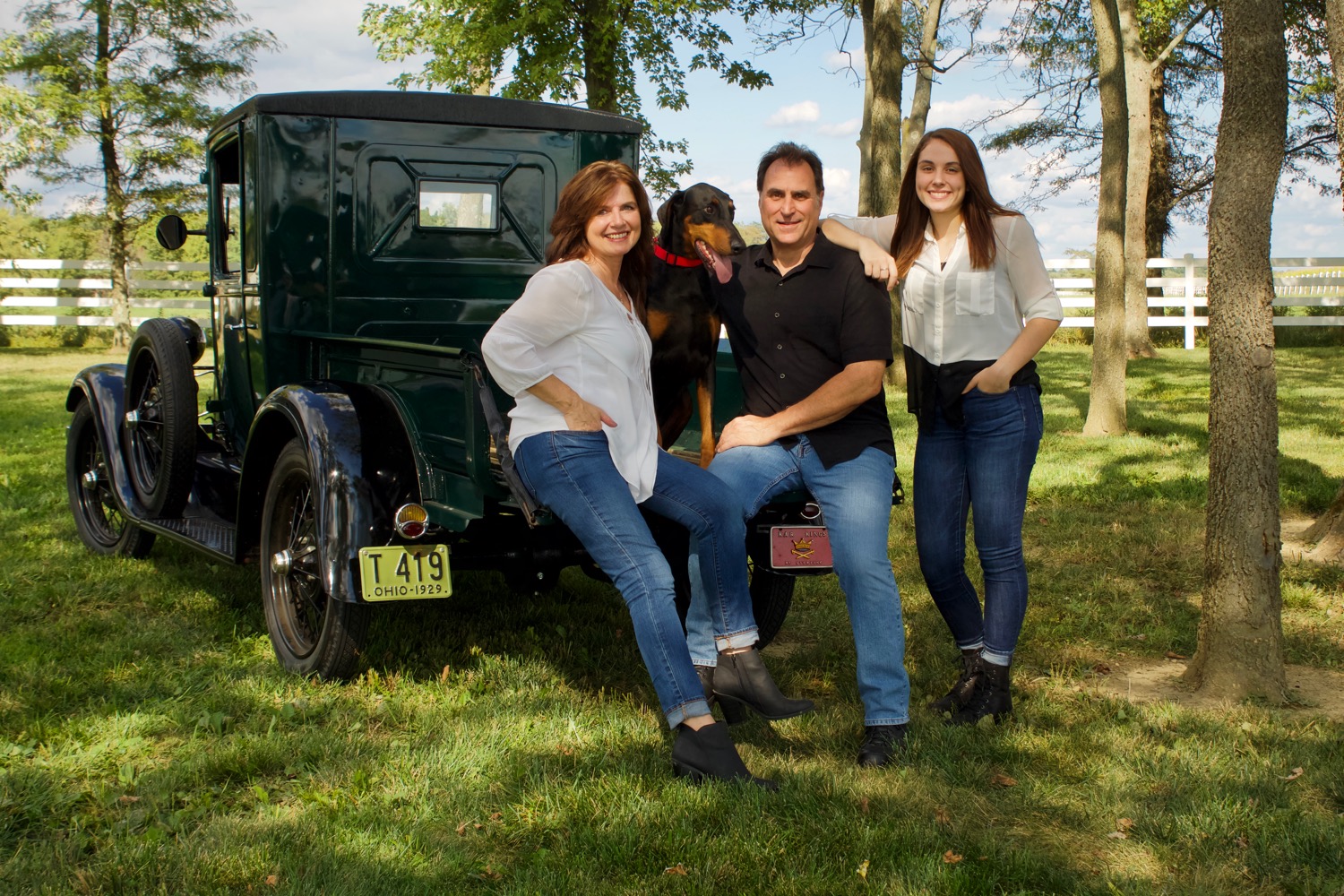
September 9, 2019 at 1:15 pm #43940Kina LambParticipantI like this one MUCH better. What, do you think is the difference? I see that one pops and one doesn’t. Why is that?
Attachments:
September 10, 2019 at 1:30 pm #44000 Lyd-BParticipant
The biggest downside with the first photo, from my perspective, is where the subjects are placed, being on the left third and facing out of the frame. They look like they’re ready to walk right out of the photo. Picture in your mind what it would look like if they had been placed on the right third, or if they were turned around. That alone would make a huge difference.
I think another thing that might keep this photo from hanging on my wall is the lack of depth. I think that this simple of a background is fine for close-ups, but with the way this shot is set up as well as the pose, there’s just not a whole lot for the eye to explore.
In contrast however, your second shot is one I would hang on the wall if I was your client!
Here are some reasons why. There’s depth! Folks in the foreground, trees in the middleground, fence in the background, and I can almost see beyond to some fields. It’s well-balanced: the truck to the left, the people in the center/to the right, and the tree framing it on the right. There’s contrast in colors and textures, and plenty to look at throughout the whole photo yet at the same time it’s not too busy. Plus the truck they’re sitting on makes it fun and unique.
September 16, 2019 at 10:57 am #44147Kina LambParticipant@bennett-family Thank you Lydia!! That really makes sense. 😀
September 16, 2019 at 3:16 pm #44162 James StaddonKeymaster
In addition to @bennett-family’s comments: the first shot is underexposed; and for the pose (which works well), I would probably have told the dad to put his hands around her waist, and then his arms would be under hers and make it look less like he’s “grabbing” her. The second shot is great. Even though it’s in dappled light, it’s not harsh on their faces and thus not ugly or distracting. Good job.
September 19, 2019 at 10:22 pm #44206Dan Cope
ParticipantI too like the second photo! Very nice! What stands out to me about the first one is that the barn wall seems too overwhelming. There is so much of it in the photo that it almost seems as if it’s a picture of a wall with a family in front of it as a opposed to being a picture of a family with a wall behind them. Also the white rim board at the bottom of the wall draws my attention away from the family. Basically I feel like this photo has more of a “random” look or a “snapshot” appearance. Kind of like they were at a family reunion and decided they should get a quick photo together before they headed home so someone said “Ok why don’t you stand here by the barn and I’ll take one for you”! Your second shot on the other hand looks very purposeful both in composition and location! It’s one they should definitely be glad to hang on the wall! There’s only one problem with it… you forgot to tell the dog to look at the camera😅
-
AuthorPosts


You must be logged in to reply to this topic.