
Home › Forums › Shoot to Serve Assignments › Opportunity: VersePic: "City on a Hill"
- This topic has 30 replies, 6 voices, and was last updated 9 years, 6 months ago by
 James Staddon.
-
AuthorPosts
-
January 23, 2017 at 1:29 pm #21043
 Andrew StevensParticipant
Howdy to all of you in the Lenspiration Community! For Sharpening Character’s VersePics Bible Memory tool this week, we are in need of an image to backdrop Matthew 5:13-14.
“Ye are the salt of the earth: but if the salt have lost his savour, wherewith shall it be salted? it is thenceforth good for nothing, but to be cast out, and to be trodden under foot of men.
Ye are the light of the world. A city that is set on an hill cannot be hid.”Requester: Sharpening Character
Purpose: VersePics Bible Memory Tool (See Sharpeningcharacter.com/versepics for more information and to see examples of past VersePics)
Suggested Image Subjects: Sunbursts, salt/sand abstracts, footpaths, or mountains. These are only suggestions though; feel free to be creative with this! (NOTE: If you submitted a sunburst or other “light” related image last week, we may consider those as well–no need to resubmit the same images. If you have a different image subject that you feel might work better or this verse however, feel free to add it on this post. The more the merrier!)
Remuneration: Being a small organization of 2 guys that is self-funded, we cannot offer any payment at this time. Any submissions received would be regarded as a gift towards advancing the Kingdom of God, and helping others to memorize and meditate on His Word.
Terms: You are granting Sharpening Character (and our partner ministry Courageous Men of the Word) the right to use your image for VersePics (be it this verse, or another at a later date. If the latter, we will verify with you before use.) You also grant us the ability to fully edit and Photoshop your photos. You continue to retain full rights to your submissions.
Priority: High
Deadline: 11:59 PM Eastern, Thursday, January 26th, 2017
Submission Notes: Please add your submissions as Attachments to your Replies. Please do not use links in the Reply, or add your submission directly in the Reply. You have the ability to upload 20 attachments (2MB or smaller) per Reply. You may make multiple Replies, but keep in mind that we only want to view your very best submissions. Please submit images that exceed 2666px wide by 2000px tall. If you submit a picture below these limits, specifically tell us in your reply so we can know beforehand. No watermarks, text, or any other image modifications please! We will credit you by your forum name with the Lenspiration Watermark in the final VersePic.
Contact: For questions, please email [email protected]
January 25, 2017 at 11:11 am #21093Abby
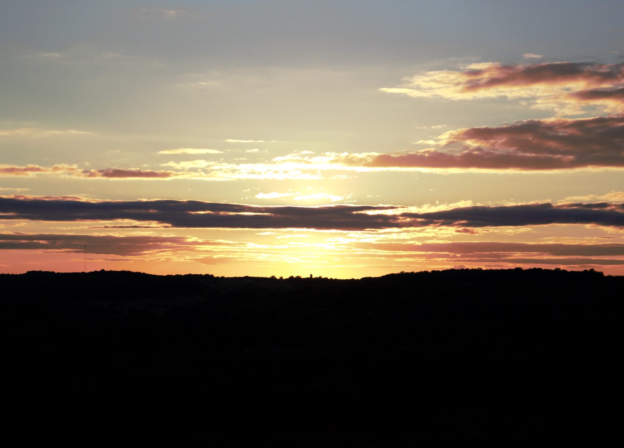
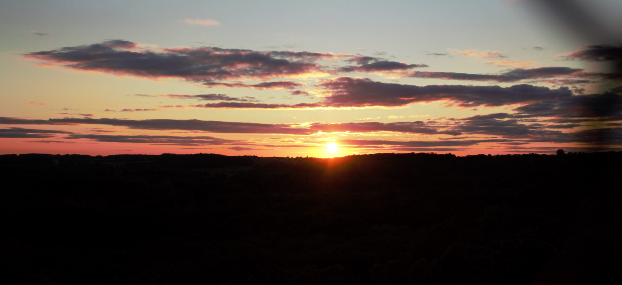
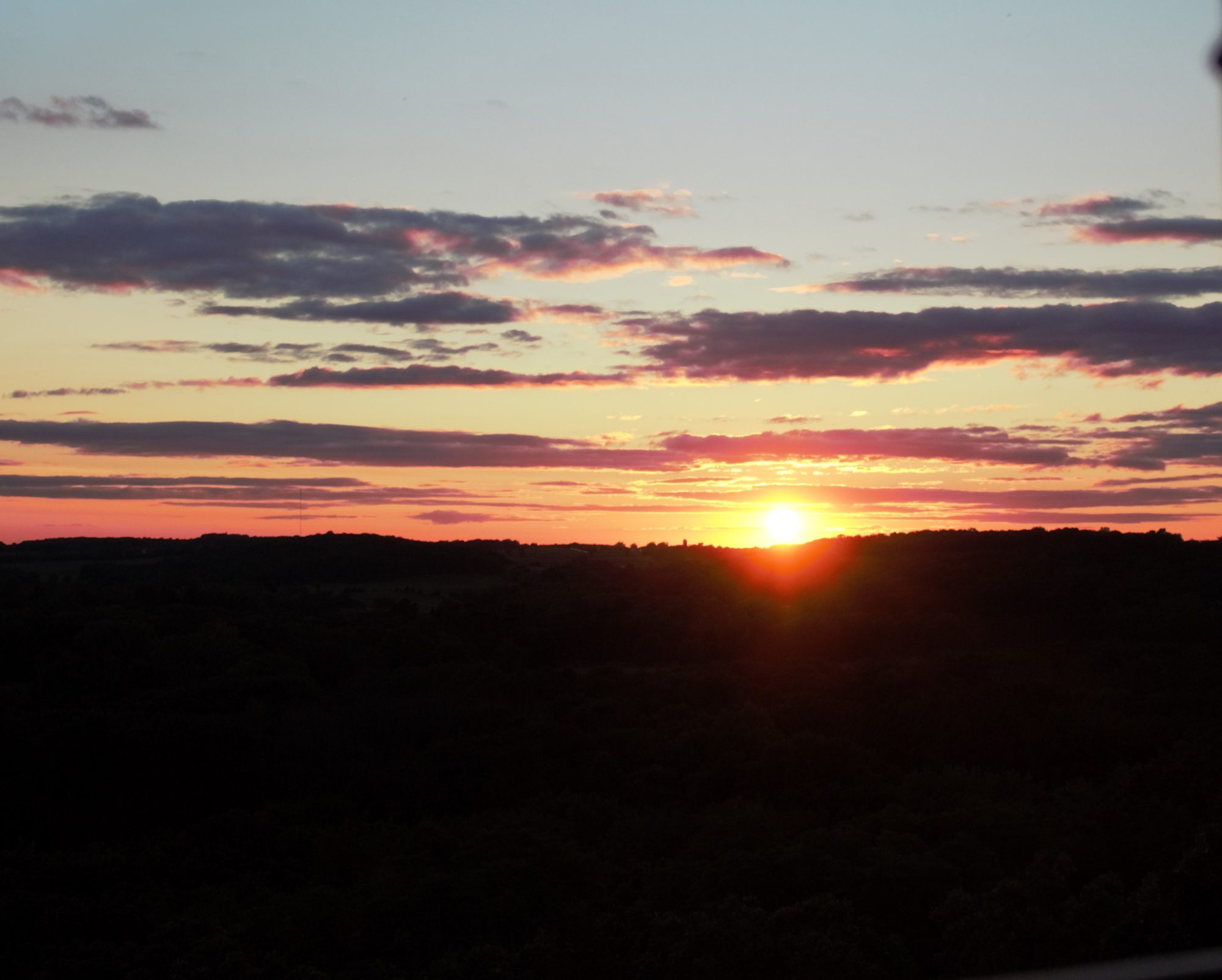
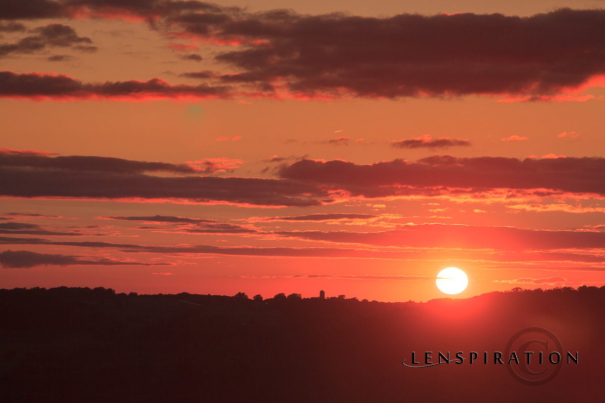
ParticipantThese pictures of a sun set overlooking a hill make me think of that verse
I hope they are helpful🙂Attachments:
January 25, 2017 at 10:16 pm #21098 Benjamin HolmesModerator
Thanks for those pictures of sunsets Abby! You know, a lot of people try shooting sunsets the second they hear someone saying anything about light, but lets be creative! The sun isn’t the only source of light around, how about some pictures practicing a pitch black background with a single candle’s flame? Perhaps a lantern’s glow? Try to capturing gleams, light streams, or other interesting sources and light effects in your lens. Lets see what we can come up with!
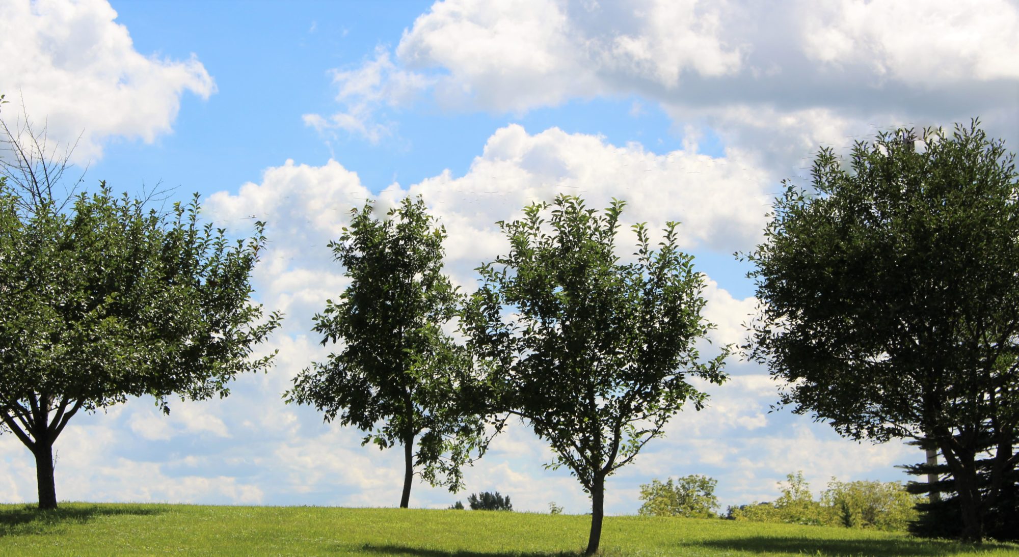
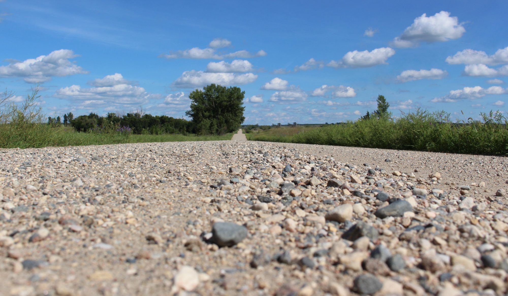
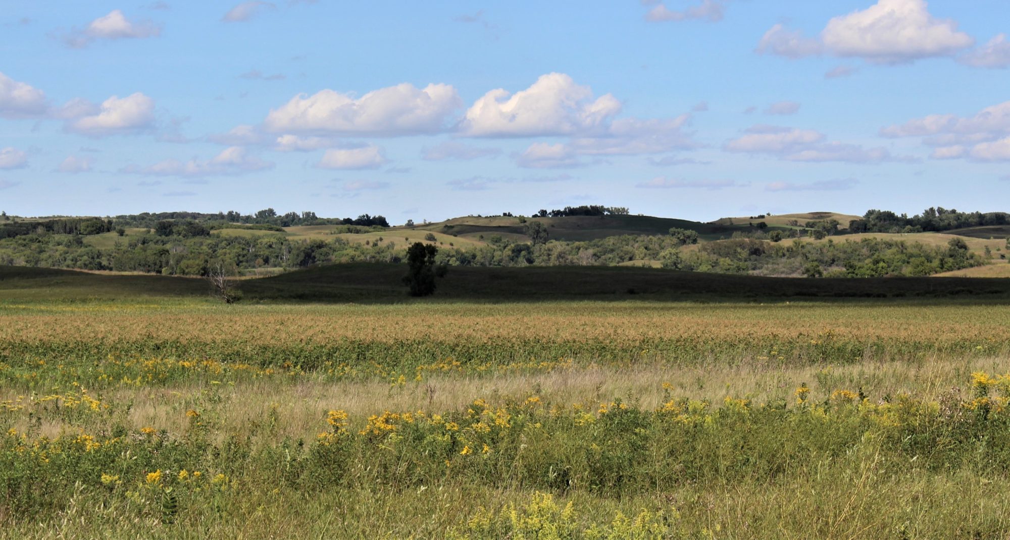
January 26, 2017 at 1:52 pm #21099ParticipantHear are some other Ideas I thought you might be able to use
Attachments:
January 26, 2017 at 8:38 pm #21105Frazer Family
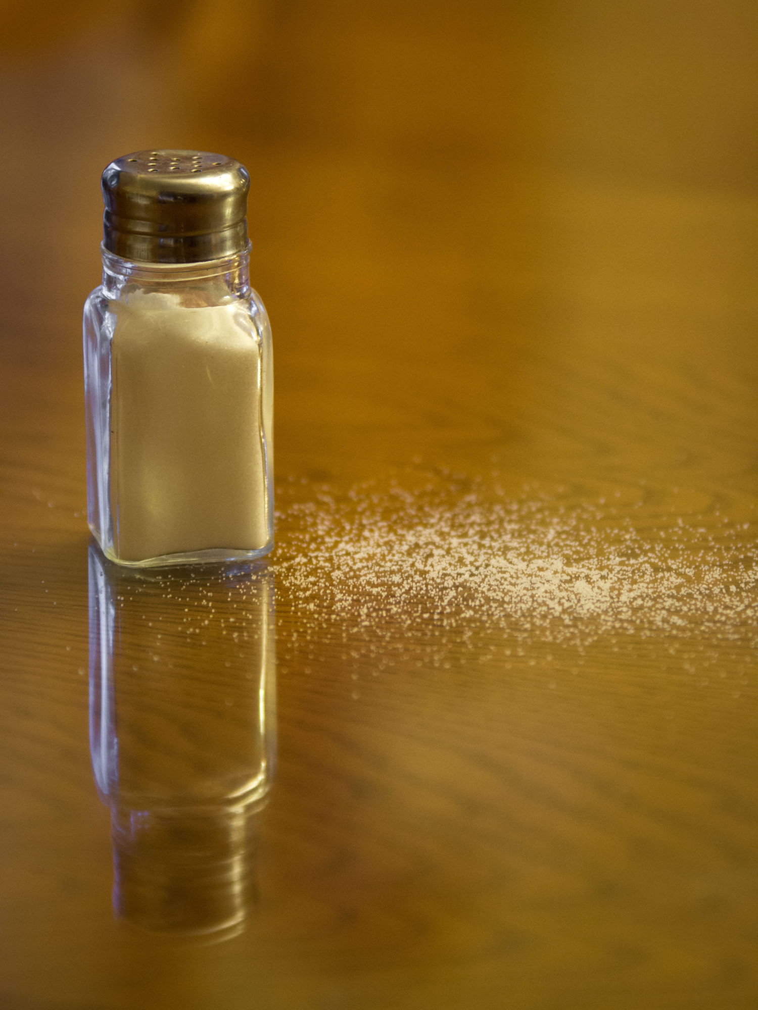
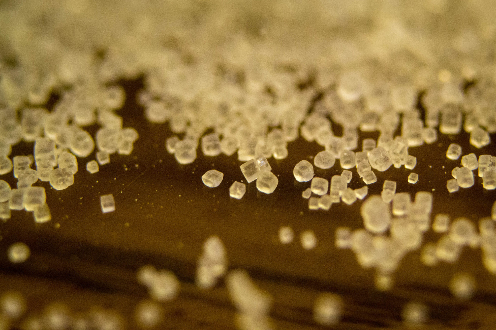
ParticipantHere are a few a took with verse 13 in mind. Sorry, @jamesstaddon, I went with the expensive macro lens… Since my dad has one, and some extension tubes, I might as well make use of it, right? 🙂
Attachments:
January 26, 2017 at 8:39 pm #21108ParticipantOK. I don’t seem to be able to submit all the photos at once, so I’ll put them in separate entries.
Attachments:
January 26, 2017 at 8:40 pm #21111ParticipantAnd the last two.
Attachments:
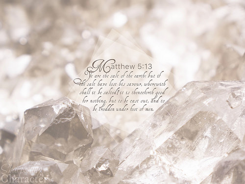
January 29, 2017 at 1:45 pm #21132Benjamin HolmesModeratorHi Lenspiration! I wanted to let you know about the finished product! Unfortunately, I wasn’t able to use any of the pictures submitted. I’ll be explaining why in the explanation post soon.
We actually decided to split up this week’s VP into two. This week will be just verse 13, rather than 13-14, while next week’s VP will be verses 14-15. Development is already underway for next week’s VP, so there won’t be a VP Opportunity next week unfourtunately…
With all of that out of the way, here is this week’s VP!
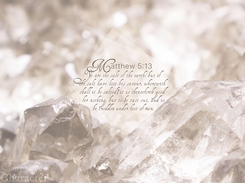
Explanation coming soon!
Attachments:
January 30, 2017 at 7:23 am #21135 James StaddonKeymaster
I recognize that sunset @abbysherlock! These assignments are really helping us to grow and push ourselves beyond our limited perspective. Keep it up!
I think the pictures of salt are great, @frazer-family! It’s nice that you have an “expensive” macro lens. 🙂 The pictures don’t appear edited at all, which is in accordance with what @bensharpeningcharacter has requested, but I do think it would be good to make the basic tweaks, like correcting white balance, straightening up horizons, remove dust bunnies, etc. Also, I’m not exactly sure why you were not able to upload more than 2 . . . @abbysherlock didn’t seem to have any trouble . . .
@bensharpeningcharacter, I’m sorry you weren’t able to use any of the pictures that were offered, but we’ll enjoy a break this week and look forward to your explanations and the opportunity next week!- This reply was modified 56 years, 8 months ago by .
Attachments:
January 30, 2017 at 4:00 pm #21158ParticipantHey how did you know. the pictures were taken from the bell tower in green lake WI, we all had so much fun that night. I can’t believe how much I’ve learned and grown as a photographer since then thanks so much for all your pointers I have really appreciated it. 📷😊
January 31, 2017 at 10:25 am #21183James StaddonKeymasterThat’s really good to hear, @abbysherlock!
Perhaps fun times just get stuck in my head . . . though I did recognize that silo on the horizon. 🙂
- This reply was modified 56 years, 8 months ago by .
Attachments:
February 3, 2017 at 5:26 pm #21242Benjamin HolmesModeratorHi Lenspiration!
The explanation is still on the way, and will be coming soon. I’ll be doing an explanation on both of the VersePics from Matthew 5, as I did split both up from their original state as one VP!
Hopefully, I’ll be able to explain a little about what we need from images for VPs as well. I would of liked to use some of the Lenspiration photos, but there were multiple reasons, including looming deadline, that I just wasn’t able to design with them. My sincerest apologies! I really appreciate the extra mile the Frazer Family went to providing me with so many options, even though I wasn’t able to use them, as well as Abby’s shots of the sunset! Thank you all for helping us out here at SC!
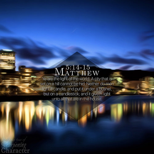
I included the new VP below to give you all a sneak-peek of what is coming up for SC next week! (The Tablet version is still in development)
Thank you all!

Attachments:
February 7, 2017 at 8:08 am #21351ParticipantThe pictures don’t appear edited at all, which is in accordance with what @bensharpeningcharacter has requested, but I do think it would be good to make the basic tweaks, like correcting white balance, straightening up horizons, remove dust bunnies, etc.
OK, I’ll keep that in mind for next time.
Also, I’m not exactly sure why you were not able to upload more than 2 . . . @abbysherlock didn’t seem to have any trouble . . .
I don’t know either. When I tried posting with all the photos attached, it sat “thinking” for quite a while and when it finally finished, nothing appeared! 🙂 I blamed the photos even though they weren’t too large and posted it with only two. That worked just fine.
February 7, 2017 at 4:53 pm #21385James StaddonKeymasterWhat do you think, @bensharpeningcharacter? What exactly is it that prompts the statement in your request, “[No] image modifications please!”?
it sat “thinking” for quite a while and when it finally finished, nothing appeared! 🙂 I blamed the photos . . .
@frazer-family, I have had this happen to me too. I thought it was my slow Internet. So I now attach 2 at a time, wait for them to upload, then edit the reply and attach two more, etc. This has worked well for me.February 13, 2017 at 9:22 am #21521Benjamin HolmesModeratorMatthew 5:13-15 VersePics Explanation
Good evening Lenspiration!
For this week’s explanation I’ll be taking a look at two very different VersePics. They actually come together in one explanation pretty well, albeit with a much longer explanation, because I faced two opposite extremes of a problem, and met both in a similar way. To really quickly point out exactly what that problem was, take a good look at these two images, and compare the “contrast”. You can also compare the finished VersePics with the original photos.
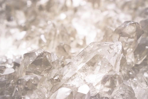
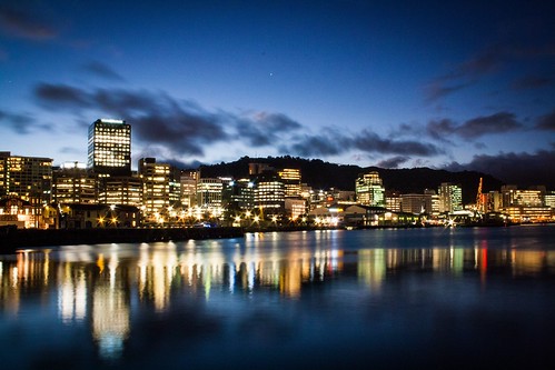
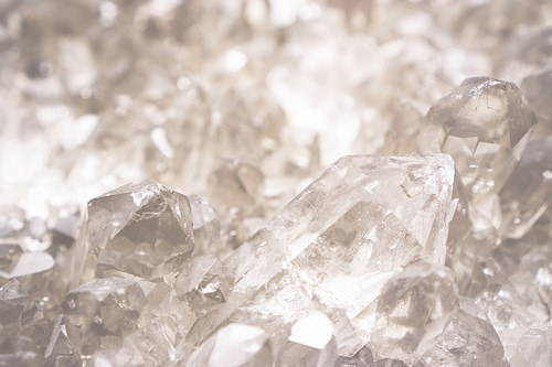
The first image of the crystals has a very low contrast ratio with light colors throughout the image, and you won’t find a color approaching black or a very dark tint anywhere. In the second image, you have a much higher contrast. There are a lot of dark and black areas, along with very bright lights. Because of these contrast ratios, both images were difficult to work with.
Now before I get to deeply into the “contrast battle” and what was problematic and difficult about these two images, let’s go over what attracted me to these specific photos, why I like them so much, as well as what prevented me from using the photos submitted by the Frazer Family and Abby.
As far as the first photo, its really just a gorgeous picture! It has a fantasticly interesting subject that is completely in focus, along with a heavily applied bokeh effect from a small aperture, giving me a background that wouldn’t interfere or detract from the verse in the foreground. One other thing that I noticed almost immediately once I started developing the VP is that the shot was taken at just the right angle to allow the two crystals to perfectly frame the text. More on that later.
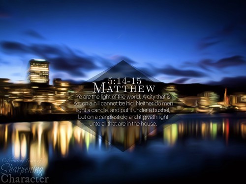
The keywords that I put in when looking for a background for the second VP were: city, hill, light, and night. That might say something about what I was looking for, and why I like this image! First, the lighting is dramatic. The photographer wasn’t afraid to experiment a bit until he got those great light bursts from the city lights, and both the heavy light distortion in the water and the slightly blurred clouds (resulting from a long shutter time) look awesome. This scene wouldn’t be nearly as impacting without those details. I liked those things so much about this image I carried them even farther in editing! (More on that later!) The second thing I have to say I love about the shot is the color. There is a huge range of blues alone in this image, with the lights of the city adding greens, yellows, and even more blues, and then they all range from dark to light! I suspect some major exposure blending went on behind the scenes here to craft that effect…
As far as the photos that were submitted to my by the Frazer Family and AbbySherlock, the photos from the Frazer Family had an odd outline around objects in the photos, which would discolor if I tried to edit the photo at all… I’m not exactly sure what was up with that, but I my personal bet is on the indoor lighting… Also, editing JPEG’s can have its drawbacks. (With iOS 10’s full support for RAW photos, however, thats a problem that isn’t necessarily a problem, except when I don’t have a RAW photo!) In any case, I couldn’t even do a simple white balance adjustment without getting either green or blue outlines on the salt, which wasn’t ideal. As far as the subjects themselves go, the ones with the salt shaker felt out of place in a VersePic, even one about salt, and I had a hard time trying to position anything to work along with the small pile of salt in those shots… As for the macro shots, I had some trouble with the focus. The shot was of the edge of a pile of salt, but focus was on the outer fringes at the bottom of the image, instead of the majority of the salt in the rest of the shot. I wish that the focus had been slightly farther away, giving me more to look at. The trouble is that the eye is drawn to what is in focus, and I when what is in focus is at the bottom, and yet I’m trying to get people to look at the verse in the middle… I had great difficulty finding a way to position the photo, and in the end, I couldn’t. One thing I found myself wishing for was some contrast in size, since all the salt crystals in the shot were exactly the same size. I found myself wanting to take some macro shots of Ice Cream or Rock Salt. These crystal can greatly differ in size and shape giving some interest to the image, and due to their size, I knew I’d be able to get whatever zoom I desired. Unfortunately, I wasn’t able to do this, as I ran up against a big deadline.
I guess my advice from this would be to alway look for interest in your composition. If there isn’t much to look at, or if there isn’t something to grab your attention and hold it, the photo ultimately won’t work very well, even if you try to add something of interest (like a verse, for a random example) later on. I alway try and find photos that have something to work with, meaning a subject that won’t just not distract from the verse, but ultimately help it. To give the example of these two VP backgrounds, I used the rock crystals in the first one to frame my text and help draw the focus to it. As for the second, the buildings immediately draw your focus to the middle of the image, while the reflections in the water, awesome sky, and outline of terrain hold it there.
As for AbbySherlock’s submissions, they lost their subject. What I mean by that is the original request was for Matthew 5:13-14, and since verse 14 is about the “light of the world” she submitted photos on light. Unfortunately, I decided I needed to cut it down to just verse 13 (after all, there is only so many words you can cram into on one VP before it starts looking crowded!) which meant that I no longer would be able to use photos of light. After we decided that we wanted to include verse 14 in another VP, creating the Matthew 5:14-15 VersePic, I did think about going back to these shots, but the verses’ subjects again changed to include the ideas of cities, hills, and candles, and I wanted to specifically use those ideas in the background, rather than a general idea of light in a sunset or in a landscape. I had quite a few options I had to narrow down, in fact, you’ll see one of the photos with the idea of “candles” later on in the explanation. Unfortunately, since I never really edited or dealt with Arby’s images firsthand, the only advice I could give about the sunset images in particular would be to go back to what I said earlier about finding an interesting subject to shoot. Try to shoot intriguing clouds, cool sunbursts around objects, or even try to get creative with the landscape in your composition. Having that subject that creates interest and holds your focus ultimately will create a far superior shot, and helps designers like me base text and a general theme off of that. Back to the explanation!
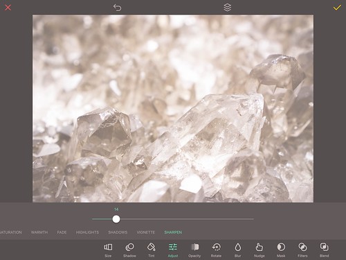
Gotta love that subtle sharpening power!On to the difficulties! For the first VP, it was low contrast, and … yeah, thats it. That was enough, however, to complicate things later on. On the editing side of things, all I needed to do was put some sharpness in to make the crystals look good, and I was set! This photo really didn’t need really anything to make it look great, while on the other hand, whenever I tried doing anything, I almost always preferred the original. (ALWAYS keep the original around, at least until you’ve completely finished editing!) I guess that’s just a result of the fact that this image is so simplistic. There is really only a variation of one color throughout the entire image! To note some of the edits that I eventually rejected, a vignette really pulled everything in great, but on this practically white background, it had a tendency to look … well, like a black gradient rather than just a darker area of the image! Other edits rejected included trying to darken the image (In a word? BLEAH! So you know how that went…), and increasing the contrast, which just didn’t look natural. I also tried different color schemes, such as silver instead of the grey-amber in the image. Once again, I just always came back to the original and loved it! Aside from the added sharpness, which I put in with Over, I decided to leave this shot alone.
I should explain something: I like to do these explanations in somewhat of a linear “chronological” style, with me finding an image, editing, and then putting text on it, but that’s not how it often works out in real life. I tend to have multiple projects for each image, each trying out a different style or look, while continually swapping in and out tons of different images behind the text to see what looks great, and what doesn’t… For this second VP, I went through quite a few styles, edits, and ideas before I finalized on this style. Let’s get into it already!
The difficulties with the original shot came from the sheer amount of detail and color contrast within the image. It was very difficult to see the text well on a background this distracting. I knew I would need to get rid of many of those details somehow, but how? Blurring worked, but I liked having colors distinct, and the buildings to be somewhat in focus. Also, even with the blur, the text still wasn’t showing up too well.
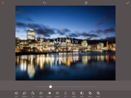
The finished text put back on the original, if blurred background.No, I really didn’t like that blurred background. “You could just put a serious drop shadow on it!” Well, I tried that, and that wasn’t working too well either. That just made the image look … not fantastic, and drop-shadowing never seems to work too well with a slim font either… Here’s the rub. I needed the details to be gone, but I still wanted a general type of focus. My solution? I went back to the paintbrush.
Now I realize that I spent the better part of the last VP explanation gushing a bit on the painting process, and I want to avoid that here. To quickly give a small explanation on this part of the process here, however, I will need to run through a bit of it, so hang on!
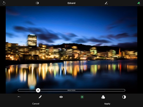
BeCassoThose who read the last VersePic Explanation will likely remember Brushstroke, an app I featured there, and may also realize that this isn’t it. This is BeCasso. Ever since I discovered Brushstroke, I’ve been rummaging around the AppStore looking for interesting photo editing tools, so when Apple ran a “Photo Creativity Sale”, I had a hard time resisting buying some of the apps. (Translation, I bought pretty much all of them!) The reason I decided to get this while already own ingredients Brushstroke, and the reason I keep it around is because of the differences between them. Brushstroke gives me unparalleled control over the colors of the paint and the medium, while BeCasso gives you control over the paint itself, with much less control over the colors. (Which isn’t that much of a problem since I can always pop the painting into Pixelmator!) I used that focus here to create a very “soft” look with few details, while still keeping a degree of focus on the city. (Arguably way more than on the blurred image anyway!)
There were some problems I had to address in the painted image. BeCasso had created sharp edges of paint in the sky and water, which both drew my attention away from the skyline, and look out of place, so I needed to do something about that.

I put the image into Pixelmator, and used the selection tools to quickly create two new layers duplicated from the base image: one of the sky, and the other of the water. I also used the refine selection option to make sure I wouldn’t be creating a Night/Day effect of softening. Using the softening tools on these two layers instead of the base image meant my buildings would stay sharp and in focus, while the unwanted distracting details would disappear.
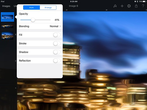
Maybe even a bit too much… Well, the water was looking okay, but less so the sky. I decided that maybe I had gone a little too far with taking down detail in the sky. This was an easy fix! I just needed to lower the opacity on the softened layer of the sky until it got back the details I wanted, and 41% seemed to work perfectly, and as long as I was adjusting opacities, lowering the water down to 70% opacity helped make everything uniform.

One quick note, using opacity in this way to adjust the strength of an edit is a really good way to get the exact strength of effect you desire, and having the edit on a different layer means that you can both quickly get rid of the effect entirely, or see the base layer without the effect instantly by bringing the base layer to the foreground. The only thing to remember is to make a strong effect, so that you can get a fine selection with lower opacities later. I have an example of this idea above. I have two layers taken from the same image that I “opacied” together to blend things I like about both of the images into one. The form of the candles and the flame comes from one, while that awesome golden color and translucent glass-like texture comes from another. If I decide I really like what I did with these layers, I can always group them together so I can edit them all at once, or compress them into one layer. Just always remember to duplicate your layers before making a huge edit, so you can quickly go back if something goes horribly wrong later on—this is a hugely superior technique to spamming the undo button, which takes both a lot of time and processing power, although I tend to take this to the extreme, which has come in handy more than once.
Finalized design and color in OverNow that both images have been edited, it’s time to get into Over and fiddle around with the verse! Jumping back to the first VP, the low contrast ratio was causing problems. You see, with such a small range of contrast and color, I realized I was suddenly going to have difficulties with adding color to image with the text and shadowing. My go-to color for text is white, as it has the highest contrast available for most backgrounds, and tends to look cleaner than a dark color. I knew that white wouldn’t work here, however, as the background has a lot of white in it already, but experiments with black didn’t work either, as it looked very out of place among all this light. I knew whatever I did would have to be some type of mix of the two. Luckily, Over has an Eyedropper in the color selection tool, so I tried to find the darkest color I could, and then made it just a bit darker. This way, the text looks natural on the background, though I was still worried about the text blending in or being hard to see in low light or with a low screen brightness. I tried drop-shadows, but they had very little effect against that background… If shadowing wasn’t going to work, what could I do? How about lightening the entire area behind the text? This would mean going back to an option I keep in case of emergencies, but I felt this this tool would be a good fit for this background, and I think I was right…
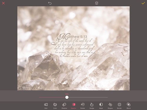
Over doesn’t have a shapes tool. What it does have is a free artwork pack with shapes in it, but that isn’t what I am using here. The Over developers released “Over Pro” a while back, a subscription service that unlocks essentially every in-app purchase in Over, premium support, and an exclusive full featured shapes tool with outlines, fully adjustable shapes, and plenty of other goodies. It runs at about $40 a year, which for me is fairly unacceptable for software at this stage. (I entirely disapprove of the subscription model, which is one of the reasons I love both the mac and iOS version of Pixelmator.) I don’t have the hardware to have the Adobe Creative Cloud Suite, but neither am I convinced I have the money for it! All that to say, minus a long story, the developers gave me a free year of Over Pro (the free trial period is seven days), so I am using an absolutely AWESOME mobile shapes tool that you unfortunately are not likely to have in the app yourself without the subscription. All I did with those awesome tools, however, was build this shape, so everything I do to the shape is available without the subscription, meaning you could still replicate the results in your own version of Over.
The finished VPAnyway, I used these awesome tools to create a customized white diamond/rhombus shape that, when rotated, perfectly aligned with both the text and the crystal to the right. I wanted the diamond to look elegant and blend in, but yet help me with the problem of the low contrast! To solve pretty much all of these problems I used arguably one of my favorite blend modes: Soft Light. Ever the experimenter, I duplicated the original diamond, set the opacity to 100%, and applied the blend mode “Multiply”. This lightened the background, yet still let it shine through slightly, a pretty cool effect similar to colored glass, but I still needed to figure out the opacity of my base diamond… High opacities looked similar to a white shape, while low opacities didn’t help with the low contrast enough. The solution? Multiple shapes with low opacity! For a truly elegant look, I went for two more duplicates of my original diamond with the Soft Light blending mode, rotated at precisely 14 more degrees than the last for a really cool effect. As for the opacities, I decided on 66% for my base layer (the only one with a “Multiply” duplicate), and 40% for the other two. All in all, I have 4 shapes underneath the text adding to the effect, and I think it was worth all the effort. (For those wondering, the base layer is the one aligned with the crystal, and the one whose edge aligns with both the reference, and edges of the verse.)
I don’t usually get into a discussion on my font choice, or how I format the text to get it the way I do, but I want to quickly go over one aspect of my font choice for this image. You see, I always try to find a font that fits the “mood” of the background, and in that respect, I had a lot of trouble with this image… I spent a long time looking for a font that would fit the idea of the image before I finally found one in my vast collection. Henry Morgan Hand seemed to fit the bill, and the fact that it took the shape I wanted after quickly fiddling with letter and font spacing seemed to cement that opinion. The real problem came with the reference… You see, there are a few fonts that I have in my collection that just don’t play nicely with others. I mean by that of course, that they are slightly “unique” and nothing else will look natural next to them. This made the reference slightly problematic. I usually look for a complementary font for the reference, but nothing would work! Well, you could say, the answers simple then, just use Henry Morgan Hand again for the reference! … it didn’t work too well, and let’s leave it at that. I finally fell on an old and faithful concept where I take the first letter of a sentence or word, and then turn that into a different font. In this case the first letter is the HMH font, while I changed the rest of the reference to one of my absolute FAVORITE fonts: SanFrancisco.
Untethering the first letter opens up a world of design possibilities. It allows me to change the size of the first letter independently of the rest of the reference, something I use here to jumbo size that “M” and fit it into my theme better, as well as allow you to creatively place the rest of the reference. This is arguably the hardest thing about detaching a letter; it has to look natural, and you need to be able to read the whole without having to think about it, therefore, you have to think hard about exactly how close and how far away you are placing the rest of the word to the letter. If the letter is too close, it’ll look weird, while if it is too far away, it won’t read well… I think I struck a good balance here.
Phew! On to the second VP!
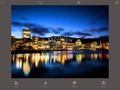
If you recall from earlier, we had just finished taking the details out of the background using a painting app called BeCasso, and took out the sharp lines created by the “paint” in the sky and in the water with Pixelmator’s Softening tool. This was all done in an effor to help the focus be upon the text, and to help it stand out from the background. I popped the background into Over and found a problem on my hands. Even with the detail removal, which improved the texts “popping” by leaps and bounds, the verse wasn’t showing up among all the lights of the city. I couldn’t use white text, as it wasn’t showing up well against the city lights, but neither could I use black, as it wouldn’t show up at all against the black areas, such as the hill behind the city. Essentially, I was having a very similar problem to what I had with the last VP’s low contrast ratio, for an entirely different reason: a high contrast ratio! The problem was this: I couldn’t make anything show up against both extreme light and dark at the same time. It had to be either one or the other… My solution? Neither! What I realized was I needed a stabilizer; something that would bring one of the two extremes down a couple notches so one color would be visible on both the light, and the dark. To accomplish this goal, I used Over’s Shape tool.
I already talked about the shape tool, so I refrain from doing so here, however, I will remind you that aside from creating the shape, everything I do to the shape can be replicated in your own version of Over.
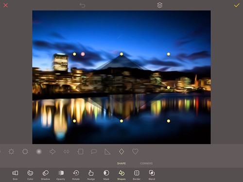
The Shapes tool in OverI started with an idea: I had this general thought that it would be cool to see three diamonds next to each other, each one slightly higher than the other to create a “wall” that would have the verse on it. Moving forward on that idea, I decided to create my own diamond, and then duplicate it twice to get the shape I wanted. Looking at that, I had the idea of having the middle one wider than the other two, a quick fix, as well as bigger. This gave me a larger amount of space to work with vertically, with a smaller footprint for the shapes horizontally. After fiddling for a while with this, I came up with the shape above, sort of a diamond sandwich, if you will. Each shape was a dark blue taken from the bottom right of the water, and was set to multiply, creating an awesome effect that allowed the city to still “shine through”, but not get too distracting. I also liked the idea of the upper and lower shapes having a lower opacity than the center, creating an effect best seen at the bottom and top of the shape that I don’t really know how to describe… Shadow mirroring? … In any case, it looked pretty awesome, so I went with it! The final opacities are as follows: 30% for top and bottom, and 44% for the center. One thing to remember is that with opacity, everything isn’t simple mathematics. You might think that in the center of the shape, where all three shapes interlap, you’d have an opacity of 104%, but that just ins’t true. I couldn’t compare the effect to a single layer’s opacity accurately,but in seperate testing, the opacity of the three had the greatest similarity to an opacity of about 67%, and yet looked so much better than just one layer! Good Grief…

On the text side of things, everything went remarkable smoother than with the last VersePic! I wanted a font that said “Cleanly Modern”, and SanFrancisco fit the bill perfectly! Have I mentioned its my favorite font yet??? 😉 Lucklily for me, SanFrancisco two different … well fonts really. One is “SanFrancisco”, a slim-line Apple designed font, while the other is “SanFrancisco Text”, a slightly wider slim-line font. Both offer lots of styles with thicker or thinner lettering, and I went for the “SanFrancisco” regular size for the verse. As I mentioned earlier, I always like to try to pick a complementary font for the reference. In this case, I liked “Latin Modern Roman Caps”. It gave me awesome numbers, something that isn’t the case for every font, and added a decently decorative style to the reference, giving me something that grabs your attention. The only trouble as with the glare… SanFrancisco is a slim-line font, which means there isn’t that much of it there, but with the reference being so much larger than the verse, I was having trouble with the reference seeming “whiter” than the rest of the text. It drew my eyes away from the important thing, the verse, and was a general distraction. I didn’t like trying to change the color of the reference, that only ended up looking messy, so I instead tried lowering the opacity of reference to compensate. That worked, and an opacity of 80% seemed about right. (By that I mean seemed about the color of the verse!)
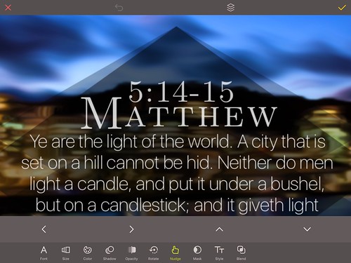
Now I faced a different problem… with my diamonds in place, I had a lot of unused space at the top and bottom that looked very empty. Part of the problem came from the verse itself: “Matthew 5:14-15” is actually a very long phrase, and trying to fit all of that in the shape made me shrink the reference substantially, creating the problem of unused space. I try to solve this here by doing something admittedly different for me; separating the chapter and verse from the book. Placing the chapter and verse on top of the book used a lot of that previously unused space, and allowed me to jumbo size the reference, which looked a lot better and allowed me to horizontally “fill” the shape. Continuing with the detaching theme, I separated the first letter of Matthew to make it even larger, giving me the ability to give a bit of a “wall” against which I could better position the chapter and verse and help it to read more naturally. Finally, after I was all done with everything, I decided to give just the slightest amount of blur to the background (6%) to just bring the shapes and the text to the foreground a bit. It didn’t get rid of any details, but did help adjust the focus slightly.
That was a lot, so if you haven’t fallen asleep already, give yourself a pat on the back. You made it! Working on the VersePics can be quite a challenge, but it’s a lot of fun for me. Part of the challenge is the deadline. I have about half a day to figure all of this out and finish everything! That in itself can lead to a lot of difficulties and emergencies. When I first talked to James, he was excited about the possibility of Lenspiration helping out with shooting great images for the background of the VersePics, easing some of the stress of finding photos elsewhere, and I really appreciate both his enthusiasm, and his help! I’ve had a lot of fun with the Lenspiration VersePics, what with editing photographers’ photos creatively, and trying to show others how I did it through these explanations. Thank you James! I also want to extend a special shoutout to the Frazer Family and to AbbySherlock for their help in submitting photos for me to use, even though I wasn’t able to use them this week. All of you are helping create a special ministry to help people focus on God’s Word. If you aren’t sure what exactly VersePics are, I would encourage you to check out the VersePics page at our website, http://www.sharpeningcharacter.com/versepics . I hope they are an encouragement to you!
Ben
VersePics Director for Sharpening Character
http://www.sharpeningcharacter.comAttachments:
-
AuthorPosts







The topic ‘Opportunity: VersePic: "City on a Hill"’ is closed to new replies.