Home › Forums › Shoot to Serve Assignments › Acts 24:25 VersePic: Passage of Time (May 19-26)
- This topic has 7 replies, 3 voices, and was last updated 6 years, 10 months ago by
 Benjamin Holmes.
-
AuthorPosts
-
May 18, 2017 at 11:52 pm #23469
 Benjamin HolmesModerator
Buenos días Lenspiration!
This week, we need photos that fits Acts 24:25.
And as he reasoned of righteousness, temperance, and judgment to come, Felix trembled, and answered, Go thy way for this time; when I have a convenient season, I will call for thee.
Your submitted photos will be used as a background to the verse as part of our VersePics Ministry, and when I thought about this verse, the images I thought of were of “seasons”, time, or possible somehow “greek, Latin, or Roman” to represent the location in which these words were spoken! There’s some ideas for you, but if you think you have a photo that would fit this verse better, maravilloso! I’m open to any ideas that you might have!
You’ll find the full details on submission rules, use of images and everything else here.
As a recap:
Request: A photo to backdrop Acts 24:25
Photo ideas: Time, Roman, Seasons
Deadline: Midnight May 26th, 2017Gracias por tu ayuda as we seek to follow God’s will in the ministry he has given to us! … and as I attempt to entender mejor Español!
Ben
Sharpening Character’s VersePic Director- This topic was modified 54 years, 4 months ago by .
May 18, 2017 at 11:55 pm #23470 Benjamin HolmesModerator
And for those of you who submit photos in RAW or DNG, here’s the DFR link! https://www.dropbox.com/request/w5rf4abOpaPBxE31JuOX
May 24, 2017 at 2:54 am #23515 Caitlin ComptonParticipantMay 24, 2017 at 3:00 am #23519
 Caitlin ComptonParticipantMay 28, 2017 at 10:49 pm #23542
 Benjamin HolmesModerator
Good evening Lenspiration!
First off, I just want to thank both Caitlin and Abby for submitting their photos! You both submitted 5 DNG files, which I love! (DNGs are awesome…) Unfortunately I wasn’t able to use any of the photos.
Please forgive me if I sound a bit harsh with some of the critique, but these are some things that we photographers need to think about, and I promise I’m not trying to be!
Both of you choose to mainly photograph the same subject, clocks, with differing results. Caitlin uploaded her photos to the forum already, so I’ll just post small previews of Abby’s submissions here.
Caitlin:
You choose to put the subject off-center, and while usually that helps with positioning the verse, the “bezel” of the clock then cuts right down the center. You’d think this would only be an issue if the clock was white, but in actuality, I’m already having to compensate for the very white calendar as well as the clock’s face, so having a black clock creates an undesirable high contrast situation… (dark text doesn’t show up well on the bezel, while white text won’t show up well on the clock face/calendar)This wouldn’t be a problem if I was doing a project in which I could off center the text as well, but I’m not. I could do something about the high contrast such as lowering the exposure to make white text to show up, but that doesn’t look great in all situations, and as a photographers, we should be trying to think of these things ahead of time so that the client doesn’t have to.
There were some problems with your choice of subject as well, at least for me. One strike against the submissions was your choice to put a calendar in the background. Honestly, this might be just me, and it probably is, but I just never like seeing an open calendar in a shot when it isn’t the main subject. I find the calendar makes the photo feel cluttered and the compisition is just not as clean as it should be.
Try and decide why you want to include each subject in your compisition and figure out whether they are adding or taking away from your subject. In the wild, the most you can usually do is look for a new angle or move closer/farther away, but in a “studio” environment, you have the ability to include or remove the object, so it is worth the time to think about your compisition.
You also submitted some pictures of leaves, and while the photos weren’t inherently bad, I didn’t feel that they quite fit the mood or feel of the verse.
Abby:
You choose to only photography clocks, and while I was glad to see you once again looking at the subject you choose from various angles, there were some problems with the shots that kept me from being able to use them.Just to start off, you submitted three photos looking straight ahead at the clock face, and another two looking at the clock at different angles, and there were different problems with both angles. These problems appeared again with your later shots that I’ll discuss below. That left me with the three straight-on shots.
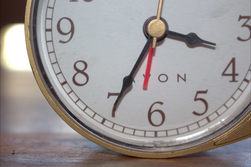
The first one was of a close up fo the bottom half of the clock face. It was only slightly off centered, which would allow the verse to easily fit on without the bezel crossing over, but it would have not looked too great in the finished VersePic because you’d only be seeing the white of the clock face as your phone’s wallpaper… Additionally, there is a bright overexposed area to the left from a light in the background that really distracts the eye. If you had just slightly moved the clock to the left to block that out before shooting, it would’ve helped a lot to get rid of that distraction from the subject.
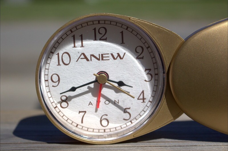
The second was taken in bright sunlight so there were very dark shadows everywhere. As this is a DNG file, I could have raised the shadows, but at the risk of plenty of noise in those areas…
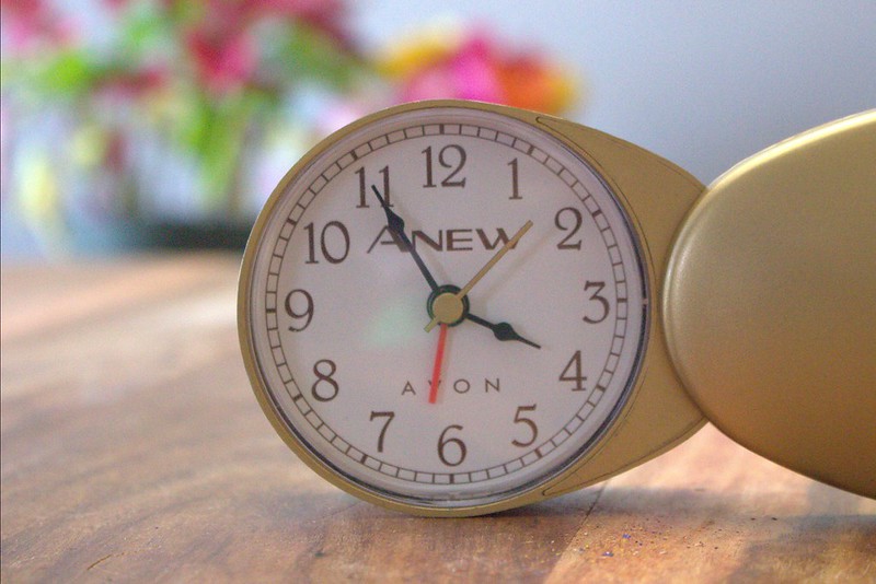
The third and final shot was taken indoors in relatively even lighting, so there weren’t any shadow problems here, and you included some nice color in the background with some bouquets. The issue was there’s only color on the left of the shot, with nothing but grey wall on the right. Since your subject was centered, the photo felt off balance. As you used a small aperture here again, I would have tried cloning one of the bouquets over to the right side of the image to balance it out, and it would have worked, except for an even bigger probem: I’m not sure if it is visible here, but your photo was covered in LOTS of green, red, and blue noise. Way too much, unfortunately, for this photo to be used…
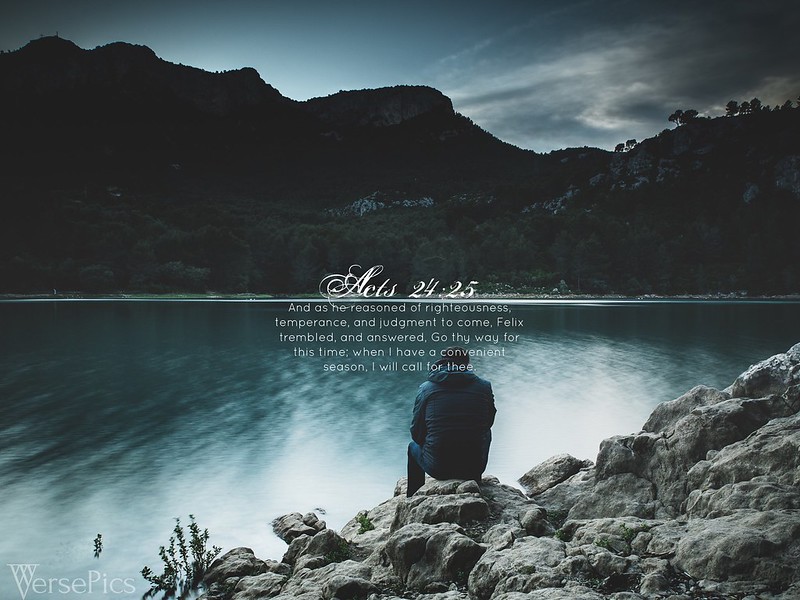
In the end, I went to another one of my sources to find the shot for the VP, and you can see the finished VersePic below!
I decided to go with this image for a couple reasons. The first one was that I just love those colors!!! That blue is awesome. 😂 The second and probably more interesting reason was that it felt like it fit the verse. The subject of the lone man in the foreground almost felt like he was waiting for something to happen, which makes me think of Paul waiting to be sent for, and at the same time, he also feels like he is pondering something, just like Festus was pondering his conviction to be saved in the verse. This quality in the photo was just too good to pass up… Thirdly, I loved where the horizon is here, as it perfectly sets up an area to place the reference, and fourthly, it felt clean. There was so much open space, and while that provides plently of room for a design, it also draws me into the scene in a way that is hard to describe.
I know, that’s a lot! Hopefully though, you’ll take the time to go through this critique and start applying what you learn to your photography! I know better than anybody I’m not the best photographer around, so while you should take my thoughts with a grain of salt, don’t let that stop you from applying yourself to growing through critique!
Ben
VersePic Director
http://www.sharpeningcharacter.comJune 5, 2017 at 12:27 am #23682 Caitlin ComptonParticipant
Thanks for your thoughts, @bensharpeningcharacter. I will try to put some of those things into practice that you mentioned! I love the picture you ended up choosing – it really suits the verse! 🙂
June 13, 2017 at 9:17 am #23772 James StaddonKeymaster
Thanks for your detailed reply and critiques, @bensharpeningcharacter!
@creative-click-photography, maybe next time take two different shots with the same setup, like one with the calendar and another without the calendar in the background. I wouldn’t have known either that Ben didn’t like blank, open calendars in the background.
@abbysherlock, from my perspective, I find the intense lighting complementing well with the gold color and “edgy” style of the clock you have photographed. Perhaps what bothers Ben the most is the cluster of shadows and hands there in the center of the clock where he would have had to somehow overlay the verse.As for the grainy shot, since you’re shooting still life, set up, indoors and it’s not moving around, you could use a tripod, set the ISO super low (like 100) and let the shutter speed go as long as needed. If the hands of the clock moved creating a blur during the long exposure….perhaps that would be a neat-looking effect! Or you could just take the batteries out of the clock.
Creative way to add color in the background too, by the way, Abby!
It’s good to hear Ben’s explanation of why he likes the picture he chose. There’s a lot of personal preference in his comments, so there’s nothing we could do about that as the photographer, but it’s neat how he says the “more interesting reason [why I chose this pictures] was that it felt like it fit the verse.” The man contemplating in a moody environment. It visually explains his interpretation of the verse. I would say that I’m surprised that he didn’t crop it to make the man’s head not interfere with the text, and that there’s a heavy unnatural vignette in the top corners of the photo, and that overall the split-tone editing style is indeed unnatural, but perhaps those elements play in his interpretation of verse as well.
Good job, everyone! We’ll look forward to the next VPO!
June 14, 2017 at 1:31 am #23819 Benjamin HolmesModerator
I hope I wasn’t sounding to harsh in all of that critique!
@AbbySherlock While on the whole, as James mentioned, the shadows add to the look of the photo, I found the contrast between the light and the shadows highlighted and exaggerated by the white border caused by the glass over the clock face very distracting. I hope that’s a little clearer!Actually @JamesStaddon, I just liked the colors of the image, and while the split toning does make the scene look unnatural, I forgave that because I loved that shade of blue! To be honest, I didn’t have much time to edit the photo, so apart from some minor color adjustments I didn’t mess with the image very much and I know it could be a lot better… The vignette was already present, and while I did tune it a bit to make it look better, it remains because when used as a wallpaper it helps direct the viewer’s focus to the verse. Additionally, I really liked the darker mood it added to the photo, especially as it tied in well with my idea of the verse! As for cropping the shot, I loved how the reference and verse fit perfectly on water’s edge, and I couldn’t get that without having text on the man’s head. I did try some other stuff with cropping and different arrangements, but I just really LIKED that waters’ edge dividing the verse and reference!
Just thought I’d explain a little more on my choices for that VP! I rarely receive critique on my work with the VersePics, and it was really interesting to receive your comments and to see what I could have done better! Thanks James! 😄
The next VPO will be releasing in the next couple of days, so keep your eye out for it!
-
AuthorPosts
The topic ‘Acts 24:25 VersePic: Passage of Time (May 19-26)’ is closed to new replies.


