Home › Forums › Shoot to Serve Assignments › Proverbs 3:5-6 VP Challenge (ends February 14) › Reply To: Proverbs 3:5-6 VP Challenge (ends February 14)
Thank you @bensharpeningcharacter! This is really good.
D1
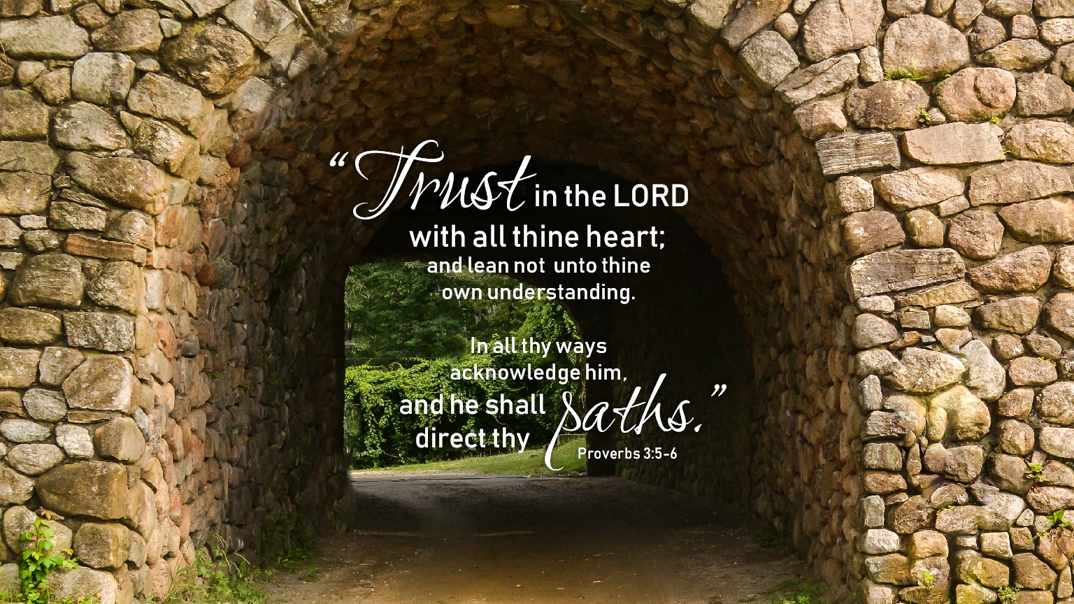
I hadn’t thought about cropping in so it would be centered. I had originally wanted to utilize the space to the right for where the verse was going to be, but then I felt like there was equal pull between the tunnel and the verse, and my eyes didn’t know what was more important. So that’s when I brought the text over to the tunnel, so the focus was all in one place. Problem is, there’s the brightness behind the tunnel, and the darkness inside the tunnel, and it was hard to read the text. This is what led me to place the words around the exit, but I agree with you, I didn’t like the way the single word per line worked out. Not sure that I’ve quite figured out something where I love the look and it’s easy to read the words.
I don’t know if you have ideas on how to get the text to be legible when it’s there on the tunnel. Even when I cropped in closer on the photo today to see how a centered composition would look, it still seemed difficult to read, and putting some sort of transparent box behind the text doesn’t seem to work with the shape of the tunnel. This definitely turned out to be a much more challenging photo than I originally anticipated!
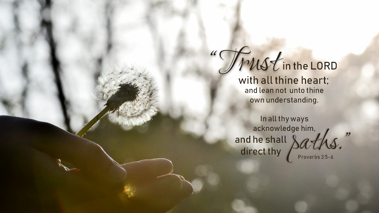
Attached are some new tries I worked out today for basic ideas. 🙂
D2
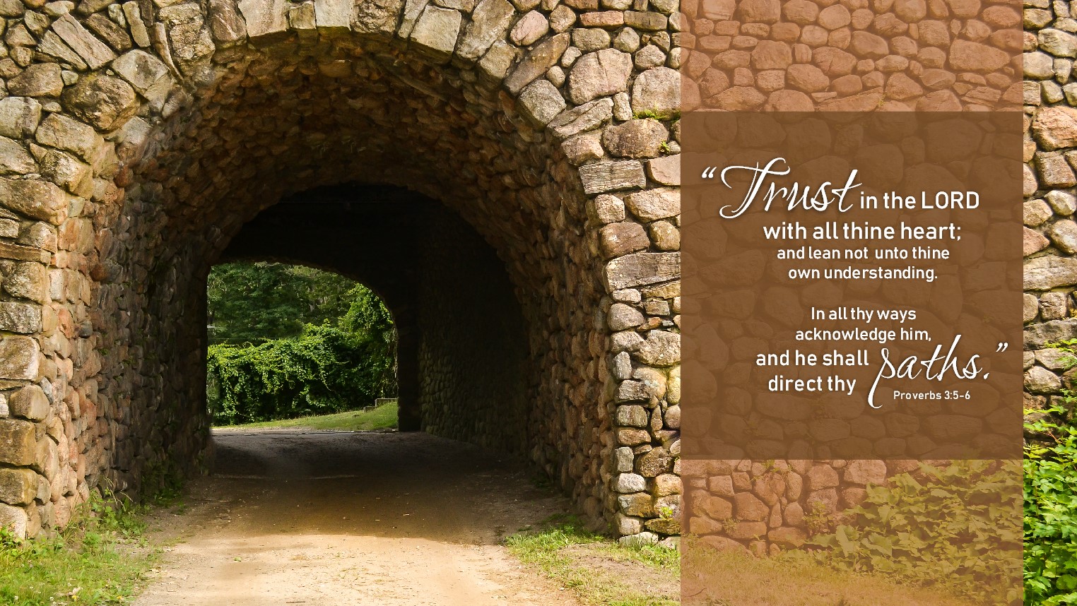
I see what you’re saying about font sizes and alignment. I tried to center things better in the attached image. Do you think that it’s an improvement?
Also, I get what you’re saying with what you mentioned in your comment on Morgan’s design about which words are emphasized; how do we balance that with using multiple fonts, or using a different size, boldness, or uppercase/lowercase to create a more appealing look than if it all was the same font, same size, etc.?