Home › Forums › Shoot to Serve Assignments › Proverbs 3:5-6 VP Challenge (ends February 14) › Reply To: Proverbs 3:5-6 VP Challenge (ends February 14)
Wow! Thanks for all the tips and encouragement, @bensharpeningcharacter! It’s been so helpful to read through your thoughts about everyone’s verspics.
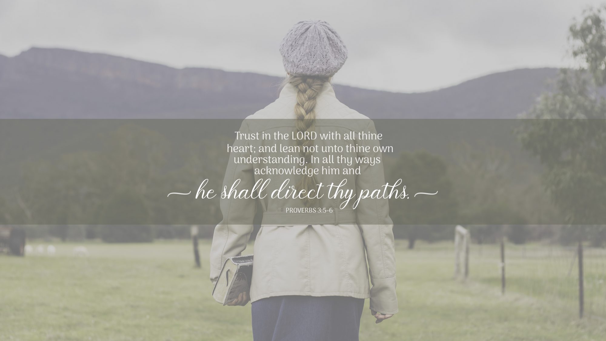
I’ve ‘updated’ the original verspics I made implementing your suggestions. Hopefully they’re a bit better now! That’s funny that you mentioned that I should do a stronger overlay on ‘Mountain Design’ – I was discussing with my sister about whether or not to do a stronger or lighter one! Now I know! LOL 🙂 I might have gone too heavy handed with it now though, but the verse does stand out more. I feel like the overlay makes the picture look very under-saturated, so I went and made the green band more opaque. Not sure if that was a good idea! Do you have any thoughts on that?
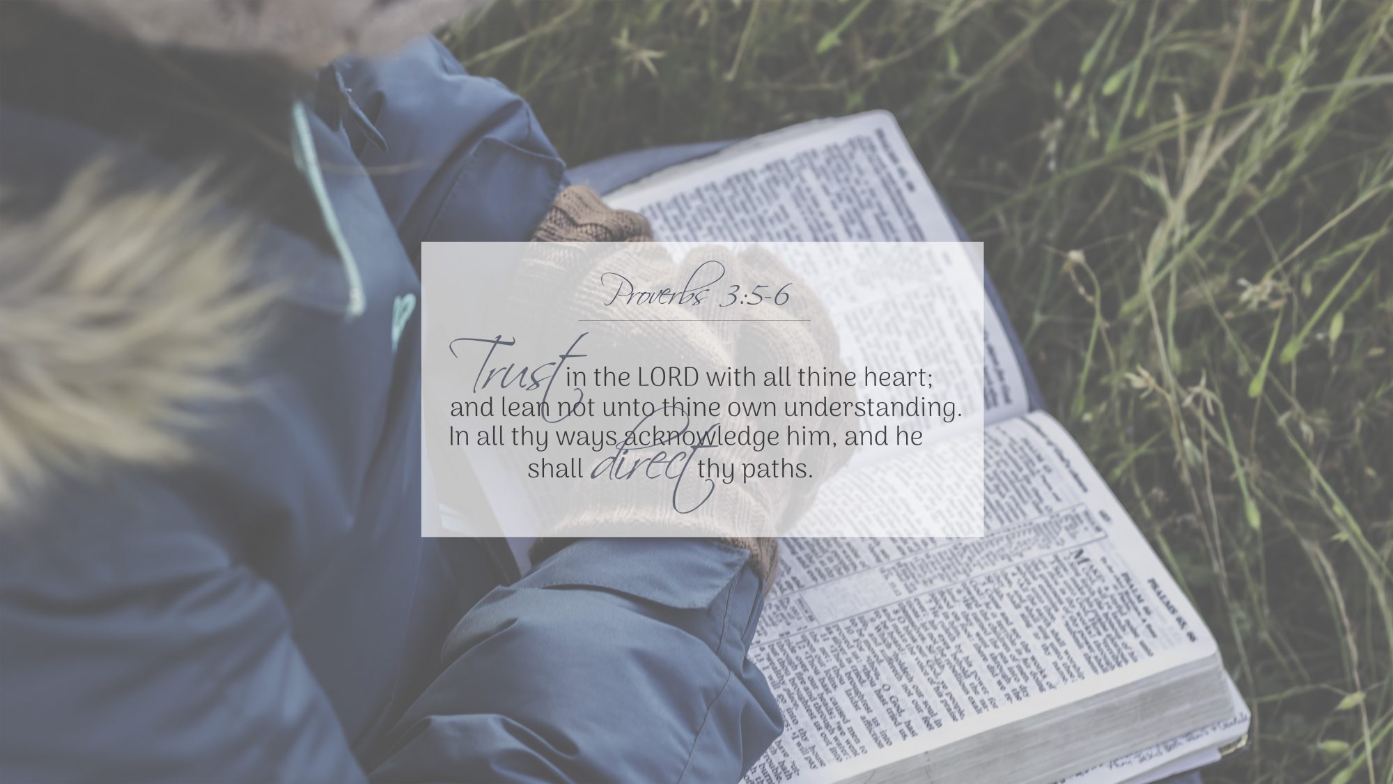
I also went and tried the Kneeling Girl one with your suggestions. I think tightening the box up a bit definitely helped, but I see what you mean with direct and acknowledge colliding! So, I tried a new font which I think looks cleaner and more easy to read.
Remember, not everyone who sees your design may be inside in controlled lighting looking at a bright screen. You want to make sure people in direct sunlight can still read your design, and that means making sure you have a good contrast between your background and text.
This is a great point and something that I hadn’t really considered, so thanks for bringing it up!