Home › Forums › Photo Critique › Moody Tree Branch
- This topic has 7 replies, 5 voices, and was last updated 7 years, 10 months ago by
 Caitlin Compton.
-
AuthorPosts
-
September 6, 2018 at 7:32 pm #33330
 Caitlin ComptonParticipant
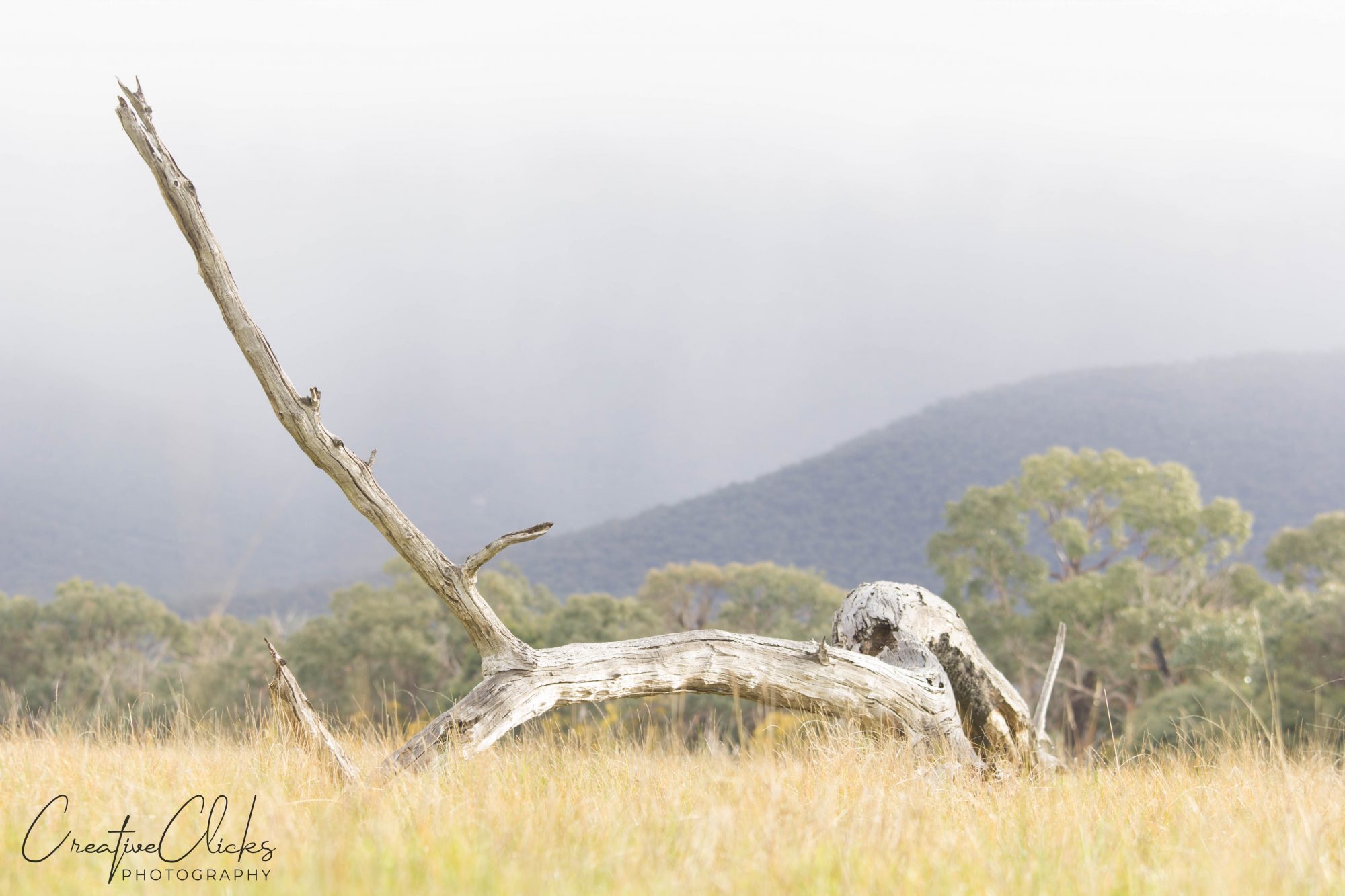
I’d been keeping my eye out for interesting subjects during one of my morning walks, when I came across this dead tree branch. I decided that this just could work! So, when I had a chance, I went out with my camera to give it a shot. It was raining, adding to the fun of standing in the paddock with an umbrella 🙂 and in-between the bursts of rain, taking pictures! I wanted to get down low, so as to have some blurred foreground elements and have the branch sticking above the tree line. As you can see, the mountains in the background are partially covered by mist/fog. One part of me feels as though the background is slightly distracting (trees, mountains etc), so I’m interested in knowing if anyone else feels the same way, or if it’s just me. 🙂 Perhaps I was a bit heavy handed in the post-processing, but I like it looking somewhat moody, because that’s what it was like on the day.
Specs:
Canon 60D
Canon 70-200mm f/4
Focal Length 100mm
ISO 100
Shutter Speed 1/50
Aperture f/5.0Thanks!
Attachments:
September 6, 2018 at 9:03 pm #33339 Lewis FamilyParticipant
I believe your post processing made the second picture quite a bit better. The clarity of the log brings out its time-worn beauty. And, the depth of field is very good. Unfortunately, the rain/mist doesn’t have enough definition to tell what it is. The obvious problem with picture is too much blank, blue rain/sky in the center. The length of the branch forces you to raise the lens to capture all of it. That leaves almost half of the picture with no meaning. (I would be tempted to break off the branch half way up. Some may think this makes it unnatural, but it’s no different than holding a tree branch out of the way to get a good angle for a shot.) However, if you could have somehow used a ladder or top of a car/truck bed and taken the picture from a higher angle, you might have been able to see less of the sky and bring in more or the ground. One last thing is that the various angles are not complimentary. The dominant branch, the rest of the log, the ground and the slope of the ridge of the hill look too random and disorganized. From all that you said, it’s obvious that you worked hard on the picture and seriously considered composition resulting a lot of good elements.
September 7, 2018 at 9:40 am #33350timtam
ParticipantI like this one.
Although way over done on your clarity settings. I would actually like to have seen it pulled back some, not cropped in, and I usually like to go in tight. There is too little space at the top left around the branch.
Also, try and see what it looks like in B&W.
There is nothing wrong with lots of blank or negative space.
- This reply was modified 56 years, 7 months ago by .
September 7, 2018 at 2:40 pm #33355 Theodore LonnemanParticipant
Personally, I think you handled the overexposure and lack of vibrance in the original image very well. The mist in the upper third of the image acts as a vignette or gradient fill layer to make that portion of the image more ‘boring’, for lack of a better word which helps to draw one’s eye to the branch. I don’t see anything wrong with the amount of ‘dead space’ in the shot. It lacks clarity or focus (which a background usually should) but it has enough texture to add some depth to the image. Crop the mist and mountains out or shoot from a higher angle and all you would be left with is a dead branch lying in dead-looking grass and you would lose some of the detail in the shot without making the subject any more defined. I do think that the portion of the branch that extends into the upper left corner forms a lead-out line, but it also forms an intriguing ‘V’ with the mountain in the background. The contrast isn’t too high in my opinion; it actually brings out more of the detail in the branch.I believe the image captures the mood of a stormy day well…converting it to B&W and adding a vignette would make it more gloomy, if that effect was desired.
September 11, 2018 at 2:05 pm #33446 James StaddonKeymaster
Those are some great comments. If I have time, I’ll add my two cents tonight on the webinar: https://www.lenspiration.com/photo-critique-with-lenspiration-sep-11/
September 20, 2018 at 5:39 pm #33688Caitlin ComptonParticipantWow! A big thankyou, @vince, @timtam, @theodore, and @jamesstaddon, for taking the time to give me your very helpful critique! It’s so interesting hearing everyone’s different opinions, what they don’t like, do like, would do different etc. It’s fascinating how everyone sees things differently and how everyone has different style preferences etc. That’s why I think it’s so important sharing photographs on here and getting critique. It helps you see things through other peoples eyes and not get stuck on what “looks good to me”. As sometimes it’s easy to be a bit bias… 🙂 So, thanks everyone!
I don’t have Lightroom in front of me right now, but B&W sounds like a great idea! I’ll give it go and see what happens. It just could be a winner. 🙂
September 20, 2018 at 6:52 pm #33691Theodore LonnemanParticipantI already had Photoshop in front of me so I thought to send your shot for a 60-second whirl and came up with this. I could have given it more time to play with the vignette but it seems to to visualize the B&W concept as intended.
- This reply was modified 56 years, 7 months ago by .
Attachments:
September 20, 2018 at 9:41 pm #33697Caitlin ComptonParticipantAha! It looks like B&W works well with this image. 🙂 Thanks, @theodore!
-
AuthorPosts


You must be logged in to reply to this topic.