

@bensharpeningcharacter
I have a passion for graphic design, web design, cinematography, photography, and all types of visual communication. The Lord has blessed me with the ability to be the VersePics Director and Co-Host of The Sharpening Character Podcast.
Forum Replies Created
-
AuthorPosts
-
Benjamin HolmesModerator
Thank you to everyone that submitted a photo! We really do appreciate your support.
Unfortunately, none of the images that were submitted were what I was looking for.
For sake of time right now, I’m going to have to be very brief.
@blessingscaptured’s pumpkins looked great, but weren’t suitable for the special simultaneous horizontal and vertical aspect ratios demanded by VersePics.
@elmullet submitted a ton of photos, and I loved the variety! Unfortunately, the photos didn’t communicate what I was looking for.
@ernestf-lloyd’s photos of mountains weren’t what I was looking for, either.
@esther’s pictures of fall decorations came the closest to working, but ultimately, the subjects are placed too far off center to look pleasing on a VersePic.—
I was trying to think of why there is often a disconnect in the submissions I receive and the pictures I have in my head even when I do ask for particular subjects. What I came to understand is that I’m usually not looking for a specific subject as much as a particular theme and a mood.
The theme will influence the subject, props, and the location. For instance, a pirate theme will likely be near the sea, nautical instruments, or boats, while a studying theme might feature a library, books, paper, and office/school materials.
When artists talk about how they feel about a piece, they are describing the mood. The mood influences the lighting, camera angles, photography style, focal length, colors, and the specific props I would or would not include in my photograph. Running with the same examples, a pirate theme emphasizing antiquity would likely focus on warmer colors, older ships and instruments, straight-on camera angles, more documentary styles of photography, and somewhat stronger contrast in lighting. If I was trying to make pirates seem exciting, I’d use more vibrant colors, creative camera angles, abstract photography styles, dramatic lighting, and a greater range of props.
One thing that I noticed in this particular assignment was that there seemed to be a disconnect between both the theme and mood I was looking for and the theme and mood of the submissions I received. I was primarily searching for a theme of prayer or internal contemplation with a mood of calm, introspective thought. This could have been communicated a little more clearly from the beginning, and for that, I apologize.
Hopefully, that was a little helpful! I’ll be a little more clear from now on in what I’m looking for specifically.
Thank you all again!
Ben
VersePic Director for Sharpening CharacterBenjamin HolmesModeratorThose are some great shots of pumpkins! I really like the last two.
I’d have to take a closer look, but they don’t seem to work really well as a phone wallpaper, which is what the VersePics are all about. It’s really difficult to find photos that look great in both 4:3 and 1:2, so don’t feel bad about that!
Again, the photos themselves are awesome! Keep up the good work!
Benjamin HolmesModeratorInterestingly enough, I saw @b-kariappa’s photo before it disappeared. Not sure quite what’s going on with that.
In any case, that’s a really cool photo, Blossom! Sunsets are pretty epic and are frequently used to represent God. Because of that, though, I think I’d like to steer away from the subject of sunsets for this Shoot to Serve assignment. I don’t know that sunsets communicate what I’m looking for.
Benjamin HolmesModeratorSorry for the delay!
Better. Try to move your text around till the entire design feels evenly visual weighted. By looking at the photo, I can tell it has a strong central weight to it, so I would move the text up even more.
Benjamin HolmesModerator@blessingscaptured
Better. Definitely better, though I think if you moved it up slightly, the design would look a little more balanced.Benjamin HolmesModerator@blessingscaptured
When something is vertically centered, there is an equal amount of space on the top as on the bottom. When something is horizontally centered, there is an equal amount of space to either side. For that photo, I thought horizontally centering (NOT vertically centering, or I would have just said centered) the text would help with the composition.
@creative-click-photography
It certainly feels more balanced now, but at a cost. You’ve definitely lost a lot of the contrast between the emphasized words and the rest of the verse. You may want to keep playing with that. Inline text is always difficult to work with!
I would definitely play around with the spacing between the reference, line, and verse. The proportions are a bit off–some places need a little more room to breathe while others have too much space.Benjamin HolmesModeratorHey guys!
I’ll continue to reply and critique VPs if you’d like to keep revising your submissions, but as it is past the deadline, I’m going to go ahead and wrap this up!
My favorite design submitted so far was one designed by Caitlin Compton.
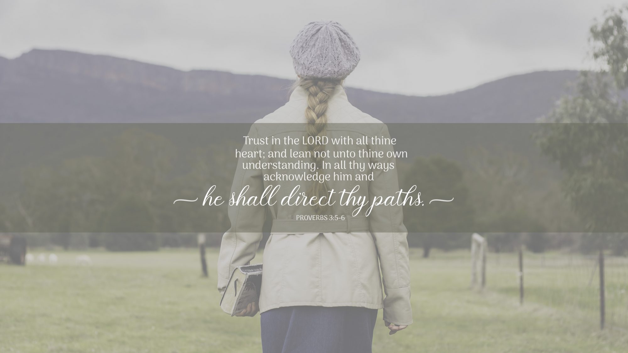
I like this because of its simplicity.
The strong vertical axis created by the centered subject and text helps keep my attention and helps me to realize where to look next. The centered layout emphasizes the symmetrical aspects of the photograph, and while I will admit freely the photo isn’t perfectly symmetrical, I do like that the subject of the photograph and of the entire design is very clear.
The text is formatted very nicely and I can immediately understand what Caitlin thought was important about this verse–if we acknowledge the Lord in every area of our lives, He will direct our paths as we rely on Him for guidance!
To Caitlin, congratulations, and to all of you who submitted, thank you! You guys did a great job revising your designs and growing from the critique. Don’t stop practicing! You guys are improving steadily.
Benjamin Holmes
VersePic Director and Co-Host of the Sharpening Character PodcastBenjamin HolmesModeratorI would definitely echo what I told @blessingscaptured about breaking up text here. You’ve got two words on their own lines, which isn’t ideal. Be careful about how you break up your text.
Your design should always have at least one axis. Think of this axis as an invisible line running through your design that things are placed up against in your design. This invisible line helps guide the viewers eye to the next line of text because they know subconsciously know where to look. Because your text isn’t on an axis here, it is harder to read than it needs to be. Unless the goal of a design is something abstract, the viewer should be able to read the text in your design very easily. Your first design was a little easier to read because it had a vertical axis generated by the centered text. Perhaps the design would read a little better if you left-aligned the verse to create a strong vertical axis.
Again, be careful about how much you choose to emphasize. Right now, you are in some way emphasizing 11 out of 29 words in your design. That’s up from the 8 you emphasized in your previous design and too many for the text to be easily discernible. Because the verse is so inconsistent in style, I have a hard time reading it quickly and telling you which words you were trying to emphasize. Think very carefully about what exact words you want people to come away with and emphasize those. You don’t need the first and last words to be emphasized just because they are first and last, and you don’t need to emphasize every keyword in the verse.
Keep working at it, Morgan! These things will come naturally with practice. 🙂
Benjamin HolmesModeratorYour updated, updated version looks a lot better, and the padding around the verse looks MUCH better! 🙂
I’m not totally sold on the display (fancy) typeface for that photo. It feels a little too bold compared to the other typeface for my tastes right now, but that could be a personal preference. Perhaps if you made the display portions of the design smaller it would help?
I don’t think putting the reference in the body typeface, all-caps, and in a lighter weight was the right call for this particular design. It adds a complication to the design that I think is unnecessary… Perhaps you could try using the display typeface there in a slightly smaller size or just make the reference the normal weight of the body typeface and reduce its size
Your second design looks much better as well! The more opaque overlay definitely helped with legibility.
It feels much more polished. Keep up the good work!
Benjamin HolmesModeratorBy far I prefer the cropped design. Nice job! It feels much more balanced than the other designs, but still feels a little unbalanced because the tunnel curves away in a certain direction. Perhaps if you right aligned all the text so it matches the exit of the tunnel and moved it over slightly to the left the design would appear more balanced.
As for the other revised design with the bridge photo, I like it better than your original, but I don’t know that I would use the color brown for the overlay there. There is a lot of that color in the photo with the stones in the bridge, and it isn’t a color that draws my attention. Perhaps if you tried a nice green? Good call on the overlay, though!
I would highly encourage you not to stick with one layout for the text across your multiple designs. Experiment. Try some new things. The layout you created will work well in some situations, but not in others. Now that you know that design works, paste the verse in with no formatting and start again. See what happens! Some of my favorite designs came out of taking some time to experiment and see what was possible. 🙂
I find it a little odd that “Trust” and “paths” have a drop-shadow but the rest of the verse does not… Try to keep things consistent across your design. If part of it has a drop-shadow, but it isn’t there to show it as being closer to the viewer than the rest of the text, either remove it or use it so the design is consistent.
You’re definitely improving! Keep up the good work.
Benjamin HolmesModeratorI definitely like the grey text better than the yellow. Great choice! It’s bright enough to stand out, but doesn’t blind you when you have a bright screen! 😉 (I’ve had some interesting experiences with this.)
I think I like the simple text breakup version you made (#1) better than the more complicated one that followed the path (#2).
#1 You placed the centered text box just a little off center to the right, and since the photo’s subject is also to the right, it makes the design feel a little unbalanced. Horizontally centered text might work a little better there.
#2 Just a quick warning. If you are going to break text up like that, be very careful to think about how the sentence flows. The best way I can explain this is to think of poetry. If you have a return or line-break that sounds jarring when you read the text aloud, then you probably want to rework the line-breaks. Group connected words and try to make sure each line makes sense. For example:
“In all thy ways
acknowledge him,
and he shall
direct thy paths.”flows a little better than
“In all thy
ways acknowledge
him, and he
shall direct
your paths.”Hopefully that makes sense!
Overall, though, much better! 🙂
Benjamin HolmesModeratorHey everyone!
Sorry I’m so late to get back to this. I got swept into a CRAZY week of school and had to drop everything just to keep up with the assignments.
I’ll be working to comment and get back on track throughout the day.
Benjamin HolmesModeratorHey Morgan!
First, I love the colors of this photograph! That rich golden color mixed with the green from the dramatic side lighting is pretty cool (or, I should say, warm. 😉 )!
Because your subject is looking away from the camera towards the background (directing the viewer’s gaze there as well) and this is a landscape photo, I would have liked to see a smaller aperture here. f/11-22 would have really helped keep the background sharp.
As I’ve said earlier, be very careful about what you want to emphasize. I like that you’re thinking beyond a single font size, but I would ask, are the words “trust” and “paths” the words you want people to immediately notice when they see your design? I’m not specifically picking on you, a few others did the same thing, but I would challenge you to think very carefully about what you want to emphasize. Remember, emphasis is most effective when used in moderation.
I think the word “trust” would be a bit more effective if it was placed inline with the rest of the verse rather than be separated off at the top there. It makes it appear as if it’s a widow, a design term for a word that is on its own line. You typically want to avoid having any widows in your designs.
The line that reads “And lean not unto thine own understanding” is a little bit long compared to the other lines of text for my tastes. Perhaps creating a new line or shuffling things around could help make the design more uniform!
Overall, though, great job Morgan!
Benjamin HolmesModeratorHey Caitlin!
Mountain Design
First, I LOVE that script typeface! It’s very elegant.
Two quick things:
I like that you kept the overlay subtle, but it’s perhaps a little TOO subtle. I’d like to see a slightly darker overlay or a subtle shadow behind the text to help boost legibility. Remember, not everyone who sees your design may be inside in controlled lighting looking at a bright screen. You want to make sure people in direct sunlight can still read your design, and that means making sure you have a good contrast between your background and text.
The reference seems a little bit small here. Perhaps if you made the text uppercase it would help with legibility.
Great work!
Kneeling Girl Design
First, I’ve got to geek out a little about the color of that coat. I LOVE IT! That’s an awesome blue that’s helped by the editing job you’ve done.
Four quick things:
Again, legibility is an issue here. The dark verse text reads fine, but the small blue script up at the top and at the bottom doesn’t read quite as well. A more opaque box could help with this.
It feels like there’s a little too much padding between the reference and the verse. I’d try to tighten that up a bit and see if it works better.
I think some extra padding on the sides of the box would help to give the verse a little more breathing space. It feels a little tight there right now.
Be very careful about letting text run into each other. “direct” interferes a little too much with acknowledge for my tastes, but not too badly. You did the right thing by putting “direct” behind “acknowledge” to help with legibility, though!
Overall, good job with experimenting with the typography, Caitlin, and lovely photograph!
Benjamin HolmesModeratorHey Aliana!
That’s a nice sunflower!
Couple quick things:
Because the majority of the photo is taken up by the sunflower head bathed in shadow and the exposure is set for the petals and sky, the photo feels a little underexposed. That certainly helps the text stand out, but I do wonder what it would look like if you brightened up the photo a little to compensate for that.
Something good to remember when designing is that any time you change ANYTHING about a design, you change the visual hierarchy (perceived importance of an element). By changing the color of the keywords to yellow, you’re effectively saying that “These words are more important” to the viewer. I know that’s the effect you were going for, so that what I just said might seem obvious, but what you do want to be careful of is using emphasis too many times. If everything is important, nothing is. Be very picky of what you want to emphasize in your design and only try to emphasize a few things.
Try to put at least two words per line at a minimum. Unless your font size is huge and every line has one word, it doesn’t look quite right in most circumstances and is known as a “widow” in design circles. Try to avoid widows.
Keep up the great work Eliana!
-
AuthorPosts