While editing the Assateague Island Field Day group photo not too long ago, I felt my typical adjustments in the Basic panel just weren’t getting it right. Maybe it had something to do with how bright both the foreground and background were? I don’t know. Here’s the best I could do using just the Basic sliders like normal:

So I tried playing around in Lightroom’s Tone Curve panel. Tone Curve can make pictures look really strange, really quick, so you have to be careful with it, but it’s quickly becoming the panel I turn to when I can’t get things to look right in only the Basic panel.
And I think it helped this photo a lot:

There’s more detail in the sky. The faces aren’t so contrasty. The sand is more colorful. Here’s what the sliders looked like between the two:


There weren’t any problems with color, so all I adjusted were the Parametric Curve sliders. I think it’s just so neat how obviously it helped the picture.
I think it’s funny that this editing comparison came to mind when I was meditating on I Thessalonians 5:17 last night, “Pray without ceasing.” What if I hadn’t “tweaked without ceasing”? ![]() I don’t know, I think there’s a whole lot more options for the way a photo can be edited if we just took the time to explore those options. And I think for each situation we’re praying about, God has a lot more for us to learn and uncover if we just took the time to explore what His perspective was on those situations. Do I really pray without ceasing? always asking Him what His perspective is on everything I do in a day?
I don’t know, I think there’s a whole lot more options for the way a photo can be edited if we just took the time to explore those options. And I think for each situation we’re praying about, God has a lot more for us to learn and uncover if we just took the time to explore what His perspective was on those situations. Do I really pray without ceasing? always asking Him what His perspective is on everything I do in a day?
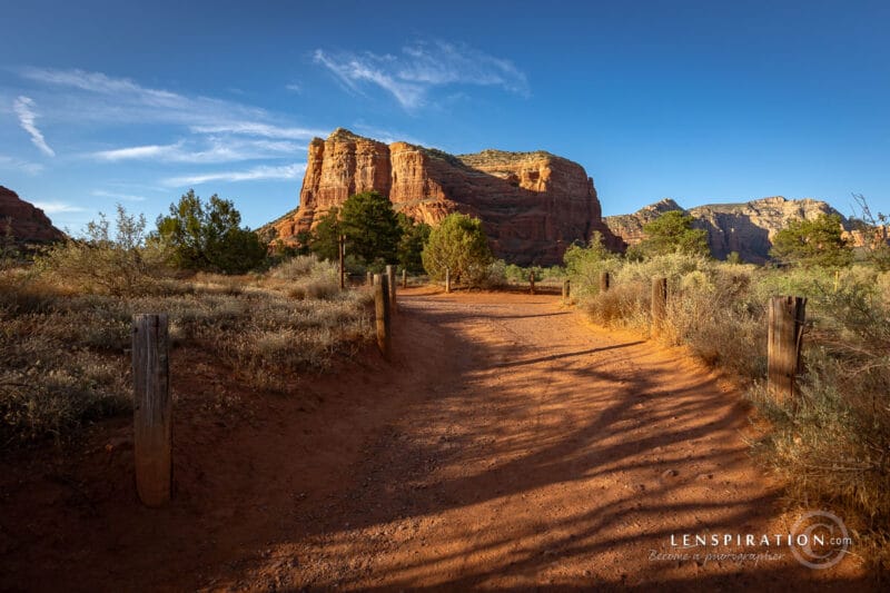
Anyway, the idea of “exploring more” with the Tone Curve really came in handy with the Lenspiration 2021 Calendar cover photo too. This was as good as I could do in the Basic panel.

And this is after playing around with it a while in Tone Curve.

There’s more detail in the clouds now. Red is always a hard color to work with when it comes to retaining detail. But it really surprised me how much the Tone Curve helped in this situation, even though the tweaks were slight. I played around extensively with each individual Point Curve this time, but I was really impressed with how much better it looked.

Tone Curve is not a silver bullet that makes every picture look better. Sometimes it just doesn’t work. For this photo of a barn taken last week, I tried getting the colors right with the individual Point Curves, and it just wasn’t helping anything. It was still too “green” or something:

So I played around with it extensively using HSL and the Basic panels. And that’s what this picture needed.

Yes, most of the changes made with the Tone Curve are very subtle, and it’s not always the right tool for every picture, but I do think it’s a panel I tend to overlook because of it’s complexity, and I just need to play with it more to really start understand it better. Now that I’ve started playing with it, my eyes have been opened to just how much more there is to explore in photo editing if I just take the time to explore it.


0 Comments