Ever since meeting James in South Korea in 2010, Ezra has been a photography geek. He enjoys all the nitty-gritty details of camera sensors, flashes, lenses, photo editing, and just about anything else photography and computer related. One of his favorite types of photography is super-macro: flowers, insects, and especially snowflakes! He was an early participant in the Lenspiration forums, and loves tackling the technical questions that come up there. He has had the privilege of traveling (and photographing) overseas often; first as a “missionary kid” with his parents, and later on during short term mission trips to southern Africa and Mexico. Apart from photography, his passions are missions, linguistics, and Bible translation.
The topic of image quality (specifically JPG format image quality) comes up every so often in photography circles, and Lenspiration is no exception (see this discussion about photo formats and quality, as well as the more recent discussion about delivering photos to clients and the relevant Lightroom quality settings). I’d venture to say that all of the photographers here at Lenspiration are shooting for the best, so they naturally want their photos to be the “highest quality” possible.
However, the downside to high quality is high file size! In the 10 years since I started taking photos I’ve amassed quite a large library! Here’s a quick graph showing the amount of space new photos were taking up in my library each year. In 2013 I got my first DSLR that could take photos in RAW format, so the amount of new photos taking up space in my library started growing exponentially after that!
 But we’re not here to discuss RAW format or my personal photo library. The question I’d like to address is this: when exporting/saving my photos in JPG format, what Quality settings should I use? Here’s the dialog that you’ll see when exporting a JPG file in Lightroom:
 Lightroom actually takes care of many complicated JPG compression options for you. Some other programs provide a much more daunting array of options, like Photometrics, Color Subsampling, Smoothing, Huffman tables, Progressive JPGs, etc. But thankfully, you don’t have to know about all of those things to get a good-looking JPG file from Lightroom. The Quality setting takes care of all of that in Lightroom.
But the question remains, what Quality number should be used?
Some photographers just set the quality slider to 100. This will definitely provide the highest quality export. However, the exported JPG will approach the size of the original RAW file. Very large! And I used to do this until I ran some experiments and realized that it was just a waste of hard drive space!
So, the purpose of this blog post is to give you some data to work with so that you can decide for yourself whether 100 actually means “highest quality” or whether you can still get a visually perceived “highest quality” export with a much lower Quality number that will save you an exceptional amount of hard drive space.
Lightroom actually takes care of many complicated JPG compression options for you. Some other programs provide a much more daunting array of options, like Photometrics, Color Subsampling, Smoothing, Huffman tables, Progressive JPGs, etc. But thankfully, you don’t have to know about all of those things to get a good-looking JPG file from Lightroom. The Quality setting takes care of all of that in Lightroom.
But the question remains, what Quality number should be used?
Some photographers just set the quality slider to 100. This will definitely provide the highest quality export. However, the exported JPG will approach the size of the original RAW file. Very large! And I used to do this until I ran some experiments and realized that it was just a waste of hard drive space!
So, the purpose of this blog post is to give you some data to work with so that you can decide for yourself whether 100 actually means “highest quality” or whether you can still get a visually perceived “highest quality” export with a much lower Quality number that will save you an exceptional amount of hard drive space.
 James helpfully provided me with a set of sample files (of the above image from a recent photoshoot) exported at different quality settings. I just plugged in the numbers to get a little chart here to show what happens!
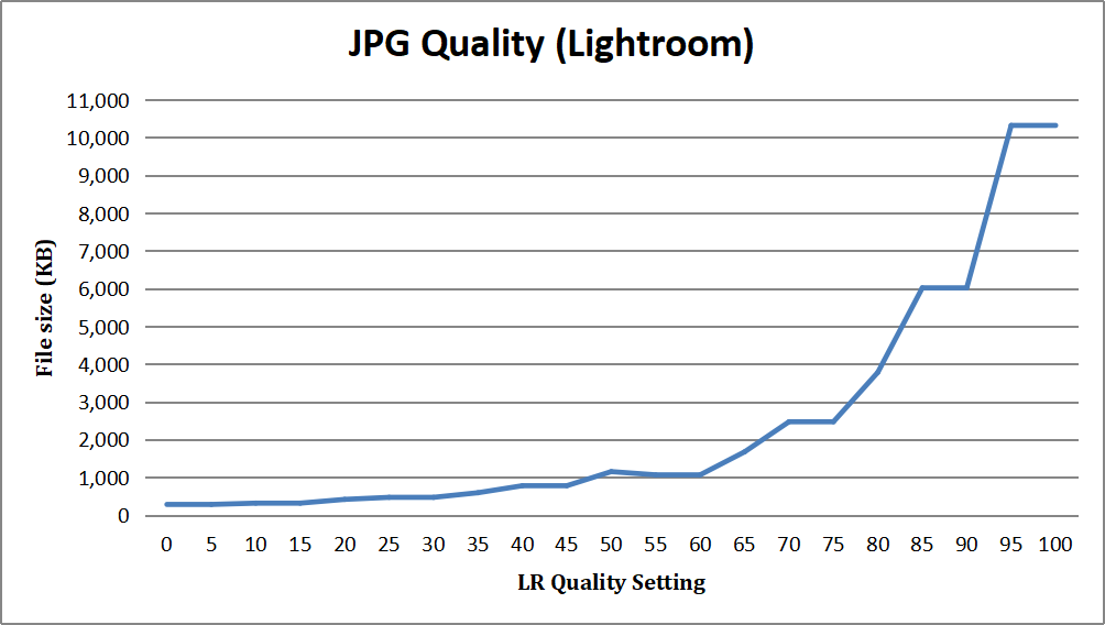 It immediately becomes obvious that we have a few anomalies!
First, notice the plateaus where the filesize doesn’t change.
Secondly, notice the huge drop-off in filesize between 95 and 90, and again between 85 and 80; the filesize nearly halves from 10.3MB to 6MB, and then nearly halves again from 6MB to 3.7MB!
I’ll forgive you for concluding that the visually perceived quality of the image would follow a fairly similar looking line, but in my (admittedly subjective) opinion, that is not actually the case! Take a look at this graph:
It immediately becomes obvious that we have a few anomalies!
First, notice the plateaus where the filesize doesn’t change.
Secondly, notice the huge drop-off in filesize between 95 and 90, and again between 85 and 80; the filesize nearly halves from 10.3MB to 6MB, and then nearly halves again from 6MB to 3.7MB!
I’ll forgive you for concluding that the visually perceived quality of the image would follow a fairly similar looking line, but in my (admittedly subjective) opinion, that is not actually the case! Take a look at this graph:
 Keeping in mind that this is my opinion (and yours may differ), you can see on the above chart that you could easily get away with a JPG Quality setting of 80 in Lightroom with hardly any noticeable loss in quality. And if we look at the chart of file sizes again, it is clear that we can save close to 6MB, which is well over a 50% savings in filesize compared to a JPG quality of 100! Below is a rather unscientific overlay of the 2 graphs. It’s not completely accurate, because they use different scales, but it is helpful for seeing just how much the 2 lines diverge:
 The takeaway is simple: quality settings and file sizes don’t follow the same trend. At all. The blue line shows file size, while the red lines shows perceived quality. You can decrease file size significantly before you start to lose much perceived quality.
For further proof, check out this comparison, and see if you can spot where a clear visual difference becomes visible. (Keep in mind that this is pixel peeping at 100%! In my opinion, you can hardly tell the difference between quality 50 and quality 100 at normal zoom levels and a normal viewing distance on a typical cheap computer monitor.)
The takeaway is simple: quality settings and file sizes don’t follow the same trend. At all. The blue line shows file size, while the red lines shows perceived quality. You can decrease file size significantly before you start to lose much perceived quality.
For further proof, check out this comparison, and see if you can spot where a clear visual difference becomes visible. (Keep in mind that this is pixel peeping at 100%! In my opinion, you can hardly tell the difference between quality 50 and quality 100 at normal zoom levels and a normal viewing distance on a typical cheap computer monitor.)
 So, here’s my conclusion: Under “normal” circumstances, you can get by with a JPG quality setting of 80 in Lightroom, and there will be no visual difference to worry about.
I can hear the question now… “But hey, what about abnormal circumstances?” And there are definitely scenarios where you do not want to pour on the compression too heavily . . .
The most obvious scenario is photo printing. A simplistic way to think about how JPG compression works (in part) is that it combines several similar colors into one color. For example, in a photo with a lot of blue sky, the compression software might combine several similar shades of blue into one. That way you only have to store info for one color instead of six or eight. This obviously is much more space-efficient, but it can cause “bands” in areas such as blue skies and gradients that are supposed to have small variations in color in order to look natural. So if you are exporting photos to print, choose less compression (93-100) or better yet, use a lossless file format (such as .TIFF) for printing.
Another scenario where you probably want to go easy on the compression, as already mentioned, is photos that have lots of subtle gradients. Compression can really mess with gradients! Below is a comparison between quality 5, quality 50, and quality 100. Notice the background on the left: see the ugly blocks of color, and how they try unsuccessfully to “fade” from one color to another? Notice also the completely mushed fine details in the hair on the left.
So, here’s my conclusion: Under “normal” circumstances, you can get by with a JPG quality setting of 80 in Lightroom, and there will be no visual difference to worry about.
I can hear the question now… “But hey, what about abnormal circumstances?” And there are definitely scenarios where you do not want to pour on the compression too heavily . . .
The most obvious scenario is photo printing. A simplistic way to think about how JPG compression works (in part) is that it combines several similar colors into one color. For example, in a photo with a lot of blue sky, the compression software might combine several similar shades of blue into one. That way you only have to store info for one color instead of six or eight. This obviously is much more space-efficient, but it can cause “bands” in areas such as blue skies and gradients that are supposed to have small variations in color in order to look natural. So if you are exporting photos to print, choose less compression (93-100) or better yet, use a lossless file format (such as .TIFF) for printing.
Another scenario where you probably want to go easy on the compression, as already mentioned, is photos that have lots of subtle gradients. Compression can really mess with gradients! Below is a comparison between quality 5, quality 50, and quality 100. Notice the background on the left: see the ugly blocks of color, and how they try unsuccessfully to “fade” from one color to another? Notice also the completely mushed fine details in the hair on the left.
 So if your photo has lots of fine detail like hair, and lots of blue sky, or other large areas of similar colors, just pay attention to how much compression you apply. A Quality setting of 80 is probably still OK in Lightroom, even for this scenario, but I suggest running your own experiments and find out what works for you. Here’s a comparison between quality 80 and 100. It’s amazing how you can’t see a difference, even at 100% zoom.
 The final scenario applies more to graphics designers than anyone else. Any image that contains text or sharp lines will suffer much faster from JPG compression artifacts than a normal photo will. Here’s an example:
 If you look at that image in fullscreen, you can see that the sharpness suffers at every quality setting but 100. Notice how the gradient suffers as well. My suggestion for computer graphics that need to be sharp and crisp is either to use JPG files at 93-100 quality, or use a lossless file format such as .PNG.
 But we’re not here to discuss RAW format or my personal photo library. The question I’d like to address is this: when exporting/saving my photos in JPG format, what Quality settings should I use? Here’s the dialog that you’ll see when exporting a JPG file in Lightroom:
 Lightroom actually takes care of many complicated JPG compression options for you. Some other programs provide a much more daunting array of options, like Photometrics, Color Subsampling, Smoothing, Huffman tables, Progressive JPGs, etc. But thankfully, you don’t have to know about all of those things to get a good-looking JPG file from Lightroom. The Quality setting takes care of all of that in Lightroom.
But the question remains, what Quality number should be used?
Some photographers just set the quality slider to 100. This will definitely provide the highest quality export. However, the exported JPG will approach the size of the original RAW file. Very large! And I used to do this until I ran some experiments and realized that it was just a waste of hard drive space!
So, the purpose of this blog post is to give you some data to work with so that you can decide for yourself whether 100 actually means “highest quality” or whether you can still get a visually perceived “highest quality” export with a much lower Quality number that will save you an exceptional amount of hard drive space.
Lightroom actually takes care of many complicated JPG compression options for you. Some other programs provide a much more daunting array of options, like Photometrics, Color Subsampling, Smoothing, Huffman tables, Progressive JPGs, etc. But thankfully, you don’t have to know about all of those things to get a good-looking JPG file from Lightroom. The Quality setting takes care of all of that in Lightroom.
But the question remains, what Quality number should be used?
Some photographers just set the quality slider to 100. This will definitely provide the highest quality export. However, the exported JPG will approach the size of the original RAW file. Very large! And I used to do this until I ran some experiments and realized that it was just a waste of hard drive space!
So, the purpose of this blog post is to give you some data to work with so that you can decide for yourself whether 100 actually means “highest quality” or whether you can still get a visually perceived “highest quality” export with a much lower Quality number that will save you an exceptional amount of hard drive space.
 James helpfully provided me with a set of sample files (of the above image from a recent photoshoot) exported at different quality settings. I just plugged in the numbers to get a little chart here to show what happens!
It immediately becomes obvious that we have a few anomalies!
First, notice the plateaus where the filesize doesn’t change.
Secondly, notice the huge drop-off in filesize between 95 and 90, and again between 85 and 80; the filesize nearly halves from 10.3MB to 6MB, and then nearly halves again from 6MB to 3.7MB!
I’ll forgive you for concluding that the visually perceived quality of the image would follow a fairly similar looking line, but in my (admittedly subjective) opinion, that is not actually the case! Take a look at this graph:
Keeping in mind that this is my opinion (and yours may differ), you can see on the above chart that you could easily get away with a JPG Quality setting of 80 in Lightroom with hardly any noticeable loss in quality. And if we look at the chart of file sizes again, it is clear that we can save close to 6MB, which is well over a 50% savings in filesize compared to a JPG quality of 100! Below is a rather unscientific overlay of the 2 graphs. It’s not completely accurate, because they use different scales, but it is helpful for seeing just how much the 2 lines diverge:
The takeaway is simple: quality settings and file sizes don’t follow the same trend. At all. The blue line shows file size, while the red lines shows perceived quality. You can decrease file size significantly before you start to lose much perceived quality.
For further proof, check out this comparison, and see if you can spot where a clear visual difference becomes visible. (Keep in mind that this is pixel peeping at 100%! In my opinion, you can hardly tell the difference between quality 50 and quality 100 at normal zoom levels and a normal viewing distance on a typical cheap computer monitor.)
James helpfully provided me with a set of sample files (of the above image from a recent photoshoot) exported at different quality settings. I just plugged in the numbers to get a little chart here to show what happens!
It immediately becomes obvious that we have a few anomalies!
First, notice the plateaus where the filesize doesn’t change.
Secondly, notice the huge drop-off in filesize between 95 and 90, and again between 85 and 80; the filesize nearly halves from 10.3MB to 6MB, and then nearly halves again from 6MB to 3.7MB!
I’ll forgive you for concluding that the visually perceived quality of the image would follow a fairly similar looking line, but in my (admittedly subjective) opinion, that is not actually the case! Take a look at this graph:
Keeping in mind that this is my opinion (and yours may differ), you can see on the above chart that you could easily get away with a JPG Quality setting of 80 in Lightroom with hardly any noticeable loss in quality. And if we look at the chart of file sizes again, it is clear that we can save close to 6MB, which is well over a 50% savings in filesize compared to a JPG quality of 100! Below is a rather unscientific overlay of the 2 graphs. It’s not completely accurate, because they use different scales, but it is helpful for seeing just how much the 2 lines diverge:
The takeaway is simple: quality settings and file sizes don’t follow the same trend. At all. The blue line shows file size, while the red lines shows perceived quality. You can decrease file size significantly before you start to lose much perceived quality.
For further proof, check out this comparison, and see if you can spot where a clear visual difference becomes visible. (Keep in mind that this is pixel peeping at 100%! In my opinion, you can hardly tell the difference between quality 50 and quality 100 at normal zoom levels and a normal viewing distance on a typical cheap computer monitor.)
 So, here’s my conclusion: Under “normal” circumstances, you can get by with a JPG quality setting of 80 in Lightroom, and there will be no visual difference to worry about.
I can hear the question now… “But hey, what about abnormal circumstances?” And there are definitely scenarios where you do not want to pour on the compression too heavily . . .
The most obvious scenario is photo printing. A simplistic way to think about how JPG compression works (in part) is that it combines several similar colors into one color. For example, in a photo with a lot of blue sky, the compression software might combine several similar shades of blue into one. That way you only have to store info for one color instead of six or eight. This obviously is much more space-efficient, but it can cause “bands” in areas such as blue skies and gradients that are supposed to have small variations in color in order to look natural. So if you are exporting photos to print, choose less compression (93-100) or better yet, use a lossless file format (such as .TIFF) for printing.
Another scenario where you probably want to go easy on the compression, as already mentioned, is photos that have lots of subtle gradients. Compression can really mess with gradients! Below is a comparison between quality 5, quality 50, and quality 100. Notice the background on the left: see the ugly blocks of color, and how they try unsuccessfully to “fade” from one color to another? Notice also the completely mushed fine details in the hair on the left.
So if your photo has lots of fine detail like hair, and lots of blue sky, or other large areas of similar colors, just pay attention to how much compression you apply. A Quality setting of 80 is probably still OK in Lightroom, even for this scenario, but I suggest running your own experiments and find out what works for you. Here’s a comparison between quality 80 and 100. It’s amazing how you can’t see a difference, even at 100% zoom.
The final scenario applies more to graphics designers than anyone else. Any image that contains text or sharp lines will suffer much faster from JPG compression artifacts than a normal photo will. Here’s an example:
If you look at that image in fullscreen, you can see that the sharpness suffers at every quality setting but 100. Notice how the gradient suffers as well. My suggestion for computer graphics that need to be sharp and crisp is either to use JPG files at 93-100 quality, or use a lossless file format such as .PNG.
So, here’s my conclusion: Under “normal” circumstances, you can get by with a JPG quality setting of 80 in Lightroom, and there will be no visual difference to worry about.
I can hear the question now… “But hey, what about abnormal circumstances?” And there are definitely scenarios where you do not want to pour on the compression too heavily . . .
The most obvious scenario is photo printing. A simplistic way to think about how JPG compression works (in part) is that it combines several similar colors into one color. For example, in a photo with a lot of blue sky, the compression software might combine several similar shades of blue into one. That way you only have to store info for one color instead of six or eight. This obviously is much more space-efficient, but it can cause “bands” in areas such as blue skies and gradients that are supposed to have small variations in color in order to look natural. So if you are exporting photos to print, choose less compression (93-100) or better yet, use a lossless file format (such as .TIFF) for printing.
Another scenario where you probably want to go easy on the compression, as already mentioned, is photos that have lots of subtle gradients. Compression can really mess with gradients! Below is a comparison between quality 5, quality 50, and quality 100. Notice the background on the left: see the ugly blocks of color, and how they try unsuccessfully to “fade” from one color to another? Notice also the completely mushed fine details in the hair on the left.
So if your photo has lots of fine detail like hair, and lots of blue sky, or other large areas of similar colors, just pay attention to how much compression you apply. A Quality setting of 80 is probably still OK in Lightroom, even for this scenario, but I suggest running your own experiments and find out what works for you. Here’s a comparison between quality 80 and 100. It’s amazing how you can’t see a difference, even at 100% zoom.
The final scenario applies more to graphics designers than anyone else. Any image that contains text or sharp lines will suffer much faster from JPG compression artifacts than a normal photo will. Here’s an example:
If you look at that image in fullscreen, you can see that the sharpness suffers at every quality setting but 100. Notice how the gradient suffers as well. My suggestion for computer graphics that need to be sharp and crisp is either to use JPG files at 93-100 quality, or use a lossless file format such as .PNG.
Summary
Unless you are printing, or your photo has text in it that has to be crystal clear, you are basically wasting hard drive space to export your photos from Lightroom at quality 100. My recommendation for Lightroom is to export at about Quality 80 for a good balance between file size and visual quality. Feel free to experiment, and find the “sweet spot” that works for you! If you have any questions or feedback, you’re welcome to ask on the forums, and I’ll try to answer as best as I can. Hopefully, any other photo experts frequenting the forums who have experience with this topic will chime in as well! If you use software other than Lightroom, then I would suggest sticking to around JPG quality 85-90, as most other software (such as RawTherapee, Darktable, GIMP, Affinity, etc.) uses a different “quality” system than Lightroom does.Additional Details
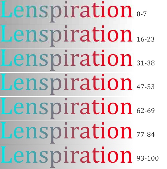
Technically, Lightroom may use the same internal system in their JPG compression algorithm as the other programs I mentioned, but in order to make their options more user-friendly, they mess with other settings behind the scenes. This may be what causes the discrepancy in quality numbers. Lightroom actually only seems to have 13 different quality settings, even though the slider seems to imply 101 different settings. Here’s the breakdown of Lightroom quality settings:- Quality 93-100
- Quality 85-92
- Quality 77-84
- Quality 70-76
- Quality 62-69
- Quality 54-61
- Quality 47-53
- Quality 39-46
- Quality 31-38
- Quality 24-30
- Quality 16-23
- Quality 8-15
- Quality 0-7


Thanks for the informative post, Ezra! The example images, graphs and breakdowns were super helpful!
It’s a pleasure, Lydia! I’m glad to know that it was helpful.
Informative, thanks
When you take raw images, you can save a lot of space by using a 7zip file manager & compressing each raw image as a 7z file. The raw image is still there (& untouched too), but (example) a 25.03 MB dng photo will compress to a 10.53 MB 7z file. If you need to see what the picture should’ve looked like (as a non raw image) (example = Did they BLINK?), use a camera program that has the option to shoot a raw image & then make a jpg copy of it. When you’re ready to edit the raw image, just unzip it.